Zee TV is the name of one of the Zee Entertainment Enterprises tv-channel, which was established in 1992, and was the first private tv-channel in India. Zee TV is specialized in family entertainment content, such as movies and tv-series, and has a huge audience all over the country.
Meaning and history
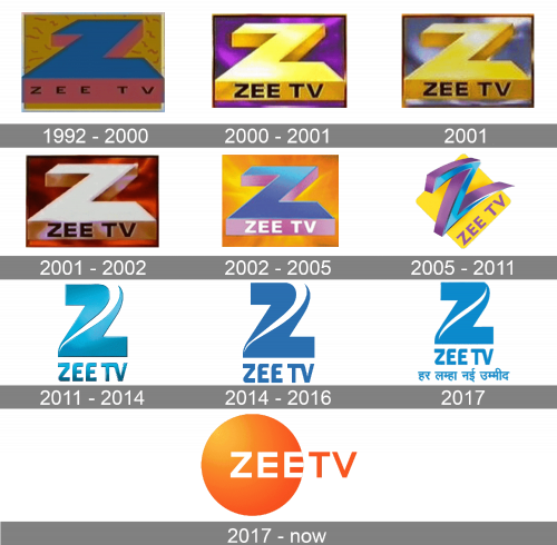
The first privately-owned channel in India has had a very intense visual identity history, which counts eight redesigns, three of which were major. As the name of the channel has always been the same, all of the logo versions were based on the letter “Z” as the central element. Throughout the years it could be seen in different styles, color palettes, and moods.
1992 – 2000
The original Zee TV logo was created in 1992 and stayed with the tv-channel for almost eight years. It was a bright and bold badge with the massive geometric letter “Z” in blue and pink, viewed from the bottom. The black sans-serif “Zee TV” in all capitals was written along the bottom pink edge of the stylized letter, making the colorful logo look professional and a bit more serious.
2000 – 2001
The redesign of 2000 refined the elements of the badge, making the “Z” three-dimensional, and its contours — more modern. The letter became gradient yellow, almost gold, with straight contours and corners. It was now set on a purple background and had the black sans-serif “Zee TV” in the uppercase rewritten in more massive and bold font.
2001
For a few months, the tv-channel has been using a logo in a light yellow and blue color palette, where the golden letter was set on a cloudy-sky background. There were no changes made to the shapes of the lettering of the badge.
2001 – 2002
A few months later, in September, another version of the logo was introduced. It was still the same concept and style, but the letter became a bit bigger and the color palette was switched to gradient red-to-black on the background, looking like a flame, and a very light, sand shade of gold for the main element. As for the inscription, it was still set in black, but the typeface became even heavier than on the previous badge.
2002 – 2005
The Zee TV logo, used by the channel from 2002 to 2005 featured the letter “Z” in two shades, gradient blue and pink, and the background in orange and yellow. This was also the first logo version, where the “Zee TV” inscription was written in white, not black, although the typeface and size remained unchanged.
2005 – 2011
A completely new style was created for the Zee TV visual identity in 2005. The color palette was taken from the previous badge, with the blue and pink (yet now closer to purple) letter “Z” set on a gradient yellow square with its corners slightly rounded. The letter was now written in a sharp custom typeface with the elongated tail, pointing to the right. As for the complete wordmark, it was diagonally set along the bottom right side of the yellow square, in light purple capitals of a bold sans-serif font.
2011 – 2014
Another design approach was implemented to the Zee TV visual identity in 2011. It happened after the complete redesign of the mother company logo. The new badge featured a gradient turquoise composition, with both the emblem and the lettering under it having its surfaces metallic and shiny. The emblem depicted a stylized uppercase “Z” composed of two fragments separated by a smooth wavy negative space. The softened elegant contours made the “Z” look like a swan or a digit “2”. As for the wordmark, it was written in a smooth slightly narrowed custom sans-serif font, where some of the letters merged, and some stood free.
2014 – 2016
The Zee TV logo was modernized and simplified in 2014, this is when the gradient voluminous composition became solid and flat. The shade of blue used for the emblem became calmer and deeper, while the lettering under the “Z” became bolder and more massive, with the contours a bit extended compared to the previous badge.
2017
For just a few months the tv channel has been using a slightly modified version of the previous badge. The two fragments, making up the “Z” was now connected on top, so only a thin white wavy line was now drawn over the diagonal bar of the letter. As for the wordmark, it looked exactly the same as on the first badge of this era. The blue shade, used for this version was slightly brightened up compared to the previous logo.
2017 – Today
A new design era started for the Zee TV channel in 2017, with the badge, created by Lambie-Narine bureaux. The lively and juicy orange badge is composed of a bold orange circle with the bold white “Zee” inscription set on its right part, and followed by the orange uppercase “TV”, written in the same style and size, but with the bars slightly thinner.


