Billa is a European retail company, which was established in 1953 in Austria. Today the low-cost supermarket chain has almost 4 thousand stores across Europe and its yearly revenue is about 13 billion EUR.
Meaning and history
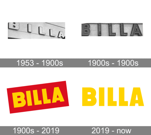
Being an economically-friendly supermarket chain, Billa has its visual identity very simple and easy. It looks friendly and inviting, showing to the customers that here they can find all the necessary goods at affordable prices. There were only two offi-cial logos designed for the company throughout its history, and they both are exe-cuted in one style.
1953 – 1900s
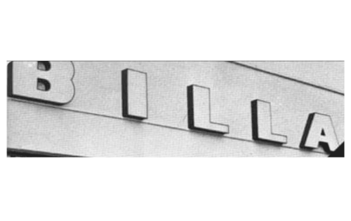
From the very beginning, the company knew how exactly it wanted the logo to look. It had the name of the chain done in a light color and printed in all uppercase letters. It used a bold, sans-serif font with straight, clean lines and square angles. This gave the logo a strong and confident appearance.
1900s – 1900s
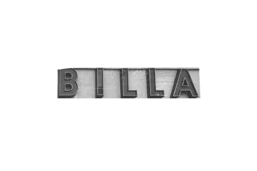
An updated version was very similar in style as it also had only the name that was done using a very similar font. The lettering, though, got darker and acquired a more defined 3D shape with a thin outline running around each letter. The modifications made the emblem stand out more on any background.
1900s – 2019
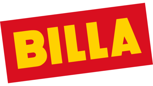
This logo was composed of a yellow wordmark placed on a diagonally oriented red rectangle. All capital letters of the inscription featured thick lines and right angles of a simple yet strong sans-serif typeface.
The red and yellow color palette of the Billa visual identity stood for love, warmth, and energy, showing the company’s attitude to its customers.
2019 – Today
With the redesign of 2019, the Billa logo became even simpler. The red rectangle is gone and the yellow wordmark is placed on a white background, in a straight line with no inclination.
The typeface of the inscription is very close to Phosphate Pro Cond Solis Regular font, which has bold straight lines with clean edges and traditional cuts.


