Big Lots is the name of the retail company, which was established in 1967 in the United States. Today it is one of the most famous housewares and grocery retailers, with more than 1,5 thousand spots across the country. Big Lots also offers electronic goods and clothing items.
Meaning and history
1982 – 1999
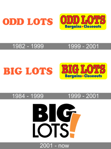
The company’s original logo looked bright and welcoming thanks to the orange color. It not only made the customers excited but also encouraged them to check out what the store has to offer. The logo featured only the original name of the brand. It was printed using all uppercase letters using thick strokes that had rounded ends. The font looked a lot like Soap Regular or VI Thuy Tien Hoa, only with a straight “O”.
1999 – 2001
This logo for Big Lots was designed in 1999 and used by the retailer for just a couple of years. It was very modern for those times inscription in a bold rounded serif font, written in all capital letters. The smooth and sleek lines of the typeface are very close to the famous ITC American Typewriter Pro Bold Condensed font, which looks professional and solid.
The use of classic style was balanced by bright color, reflecting energy, movements, and a progressive approach. This combination made the logo truly remarkable.
1984 – 1999
Until all stores were rebranded as “Big Lots”, the company used the “Odd Lots” name alongside the newly opened “Big Lots” stores. Both logos looked almost identical thanks to the use of the same color and font. the fact that the word length was also the same only enhanced this effect.
1999 – 2001
Just like with the previous versions. The company created a “Big Lots” version that featured a yellow rectangular background, bold red lettering for the name, and a smaller inscription underneath that said “Bargains – Closeouts”.
2001 – Today
The visual identity of the large American retail company has only been redesigned once again in 2001.


