Canadian Tire is the name of one of the largest retail companies in Canada, which was established in 1922. Today the company has almost 2 thousand locations across the country, with the gas stations and stores, offering such products as homeware, sports apparel and equipment, leisure goods, and automotive components.
Meaning and history
Canadian Tire was born at the beginning of the 1920s when the Billes brothers bought the Hamilton Tire and Garage business in Toronto. The brothers started actively developing the tire retail business, and by 1927 the company has significantly grown. This is when the Canadian Tire name came up.
In the next decades the company was evolving and developing, and it happened mostly due to the franchise system the Billes brothers employed. The first Canadian Tire franchises were free and gave a lot of freedom to the owners, and a lot of experience to the brothers. The variety of stores in the region made them expand the variety of goods offered in the stores. The next step was setting gas stations at every location.
Today Canadian Tire is not simply an automotive parts retailer. It is one of the largest chains of home supply stores, plus apart from retail the company also has its subdivisions in insurance services, real estate investments, and financial consulting.
What is Canadian Tire?
Canadian Tire is one of the largest players in the home supply and automotive parts retail segment in Canada. The company was established at the beginning of the 1920s, and by today has opened over 1,5 thousand locations all over the country.
In terms of visual identity, the Canadian Tire company stays loyal to its badge, designed at the end of the 1960s. Its bright and intense logo combines all the necessary elements: the tribute to Canada, the graphical representation of the automotive specialization of the company, and the colorful representation of its power and expertise.
1926 – 1935

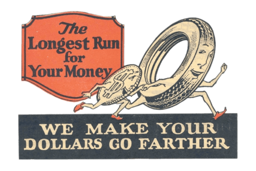
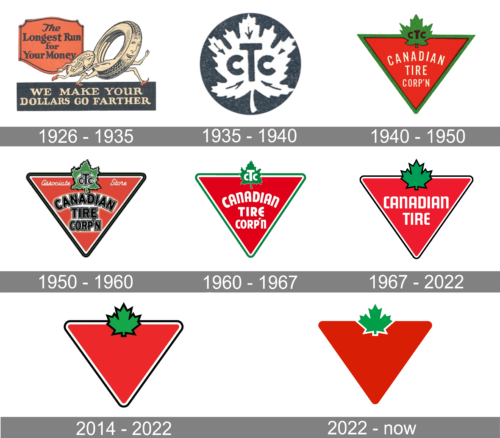
As the company was expanding, it began to work more on its visual identity. Initially, it looked more like an advertisement. The most interesting part of the emblem was a tire and dollar coin characters running hand in hand with a happy face. Underneath, there was a black banner with a beige inscription that said “We Make Your Dollars Go Further” in two lines. This claim was accompanied by another similar one. The inscription “The Longest Run for Your Money” was placed in the upper left corner on a bright orange ornate background.
1935 – 1940

The new emblem was very minimalistic in comparison to the previous. It was just the initials of the company that were done symmetrically and placed on a white maple leaf. A black circle served as the base. The designers did not forget about the details and made the veins in the leaf point to the initials. As many know, the maple leaf is an important element in Canadian symbolism. This way, the company strengthened its position as a local company.
1940 – 1950

It was this logo that set the base for all the following versions. The company used a red inverted triangle with a thin black and green border as the background. It preserved the maple leaf icon with the initials and added it at the top of the triangle transforming the color palette to green and black. The full name, Canadian Tire Corp’N, was printed in white across the triangle. The logo reflected the Canadian roots of the company and surely was more attractive than the previous black and white emblem.
1950 – 1960

The company worked on improving its emblem. For this logo, they decided to print the name in bold black font and added a white glow behind the inscription. The green in the border was replaced by black which was accompanied by a thin white line. Overall, the logo looked heavier and harder to read, although the designers probably wanted to create an image of a stronger company.
1960 – 1967

Ten years after the last update, a new brand image was introduced. It looked lighter and brighter thanks to a complete elimination of the black color. The name was printed in white again, but using bolder strokes in comparison to the 1940 version.
1967 – 2022

The Canadian Tire logo, designed in 1967, is composed of a solid red badge, drawn in a triangular shape, pointing down. The badge looks like a road sign, which represents the roots of the company. The red triangle with softened corners features a thin double outline in white and black and has a green maple leaf set on its top part. The white sans-serif lettering with the name of the company is written across the red background on two levels.
The secondary version of the logo comprises the red triangular sign with the green leaf set on the left from the red uppercase (apart from two letters “N”) “Canadian Tire” inscription written in one straight line.
2014 – 2022

The red triangle with a green maple leaf became very much associated with Canadian Tire. Thus, it was decided to remove the name altogether. The shape was redrawn to have more rounded corners, while the outline of the maple leaf as well as the shape was made noticeably thicker.
2022 – Today

The new logo looked like an overly simplified version of the logo created back in 1940. The designers removed the black outline seen in the previous logo. Instead, they added a thin white outline around the maple leaf, making it appear like it had some volume. The logo looked very modern and showed how much a successful brand image can tell about the company even if there is no name.
Font and color
The bold and condensed sans-serif “Canadian Tire” lettering from the primary logo f the retailer is set in the mixed case, with all letters but the “N”s capitalized. Although the typeface was designed fr the company in the 1960s, it looks quite similar to the modern Pop Tune JNL.
As for the color palette of the Canadian Tire visual identity, it is composed of intense red and green shades, accompanies by white and black details, which add professionalism and clarity to the solid bright hues. The badge looks juicy and powerful, being eye-catching and easily memorable.


