Acme Markets is an American chain of supermarkets. These stores mostly sell food products. The franchises are largely present throughout the American East Coast – in particular, in New England. There are currently over 160 retail stores owned by Acme, which makes them very successful in Northeast, but not much elsewhere.
Meaning and History
The first of these stores appeared in 1891 in Pennsylvania. After expansion and merging with other companies, Acme became one of the big retail store chains in America. In particular, it’s been the biggest such company in Northeastern US for a long time. The brand is owned by Albertsons Corporation.
What is Acme?
Acme, or Acme Markets, is the name of an American grocery stores chain, which was established at the end of the 19th century, and by today has grown into a large company with more than 160 locations across several states of the USA.
1954 – 1960
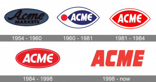
The original version of their ‘fish eye’ logo was adopted in 1954. It was a blue oval featuring the wordmark ‘Acme Markets’ inside. They used a cursive font for the former word and a basic sans-serif one for the latter. Both were colored black.
1960 – 1981
The 1960-adopted emblem really had an eye shape – basically, an oval with acute tips on the sides. The basis was a white shape with blue rims. Inside, they put a red circle near the left tip and a similar eye shape to its immediate right. The coloring for the latter was fully dark blue with the white word ‘Acme’ inside.
1981 – 1984
This time, they swapped all blue for red and got rid of the circle. The inner eye shape is now in the center and much larger. The wordmark didn’t change – it’s still a slightly tilted sans-serif in full white.
1984 – 1998
The 1984 design is again a red oval with a white line running along the edges, on the inside. In its center, there was still a wordmark just like before, but with taller letters.
1998 – today
Since 1998, they started to use the wordmark and only that. The letters are now bigger, bolder and red. The font changed to a less smooth style, but the general design persisted.
Font and color
The ExtraBold italicized lettering from the primary Acme badge is set in a sharp geometric typeface, which is pretty close to such fonts as Drop Case Italic and Blunt Regular Italic, but with the contour of the letter “C” modified.
As for the color palette of the Acme visual identity, it is based on a calm and muted shade of red, a smooth hue, which shows the company as a progressive and confident one, and also reflects the main aim of the chain—making the customers happy.


