

![]() Big Brother Logo PNG
Big Brother Logo PNG
Big Brother is the most famous and popular reality TV show around the world. The producer of Reality TV John de Mol tried to recreate a live life in the conditions of a totalitarian regime. A person is forced to survive every day in a space isolated from the rest of the world, the so-called network, under the watchful eye of Big Brother. Spectators are invited to intervene in the fates of the participants and influence the course of the game.
Meaning and history
![]()
The reality show “Big Brother” first appeared on a small Dutch channel on September 16, 1999, and within a week it broke all popularity records. The Big Brother finale was watched by every second resident of the country.
The essence of the show is simple: several people live in a confined space under the supervision of Big Brother. His word is law. Disobedience means being sent home. The house is packed with cameras, which round the clock monitor every step of the participants.
Heroes are deprived of any contact with the outside world. They receive tasks that should unite them, and raise their team spirit. Every week the heroes of the program choose two candidates for elimination. Viewers by text voting kick out one of them. On Friday’s studio show, the host announces the results and discusses life “behind the glass” with stars, celebrities, and viewers. The last contestant left in the house is considered the winner of the project and receives the grand prize.
Originally, Big Brother is a character from George Orwell’s novel of the same name. After the release of this sensational work, this is how the state or any social organization seeking to establish total surveillance or control over people came to be called. In the reality show “Big Brother” these very goals are pursued: the participants are watched 24 hours a day by dozens of video cameras placed all over the house.
What is Big Brother?
Big Brother is the name of a reality show that first appeared on TV screens in 2000, reaching the peak of viewer popularity in 2002, when it was watched by millions of people. The concept of the show is that viewers can watch almost every minute of the life of the characters of the project, placed in an isolated house.
In terms of visual identity, for each country, the logo of the show is slightly modified, plus there are different versions of the Big Brother badge depending on the season of the show, hence, there are dozens of different concepts and designs.
Big Brother USA Logo Timeline
2000
![]()
The first season of the Big Brother show was launched in the USA in 2000, so the first logo saw the light in the same year. It was a voluminous blue and white oval medallion with bold geometric lettering underlined by a white wave. The negative spaces of the “G” and the “O” were colored in black.
2001 – 2014
![]()
In 2001 the new version of the Big Brother logo was introduced. Now it was a bold and narrowed uppercase sans-serif inscription, written in two lines, in yellow, against a transparent background, and accompanied by a graphical emblem, which depicted a black-and-white photo of a human eye enclosed into a yellow frame in the shape of a house. This version of the logo stayed with the TV show for several seasons.
2014 – 2020
![]()
Another redesign of the Big Brother visual identity was held in 2014. This time the logo was redrawn in a three-dimensional form, with the silver lettering inscribed into two geometric elements — the upper one in the shape of a house, and the bottom — a horizontally stretched parallelepiped. The color palette of the badge was switched to gradient blue and silver.
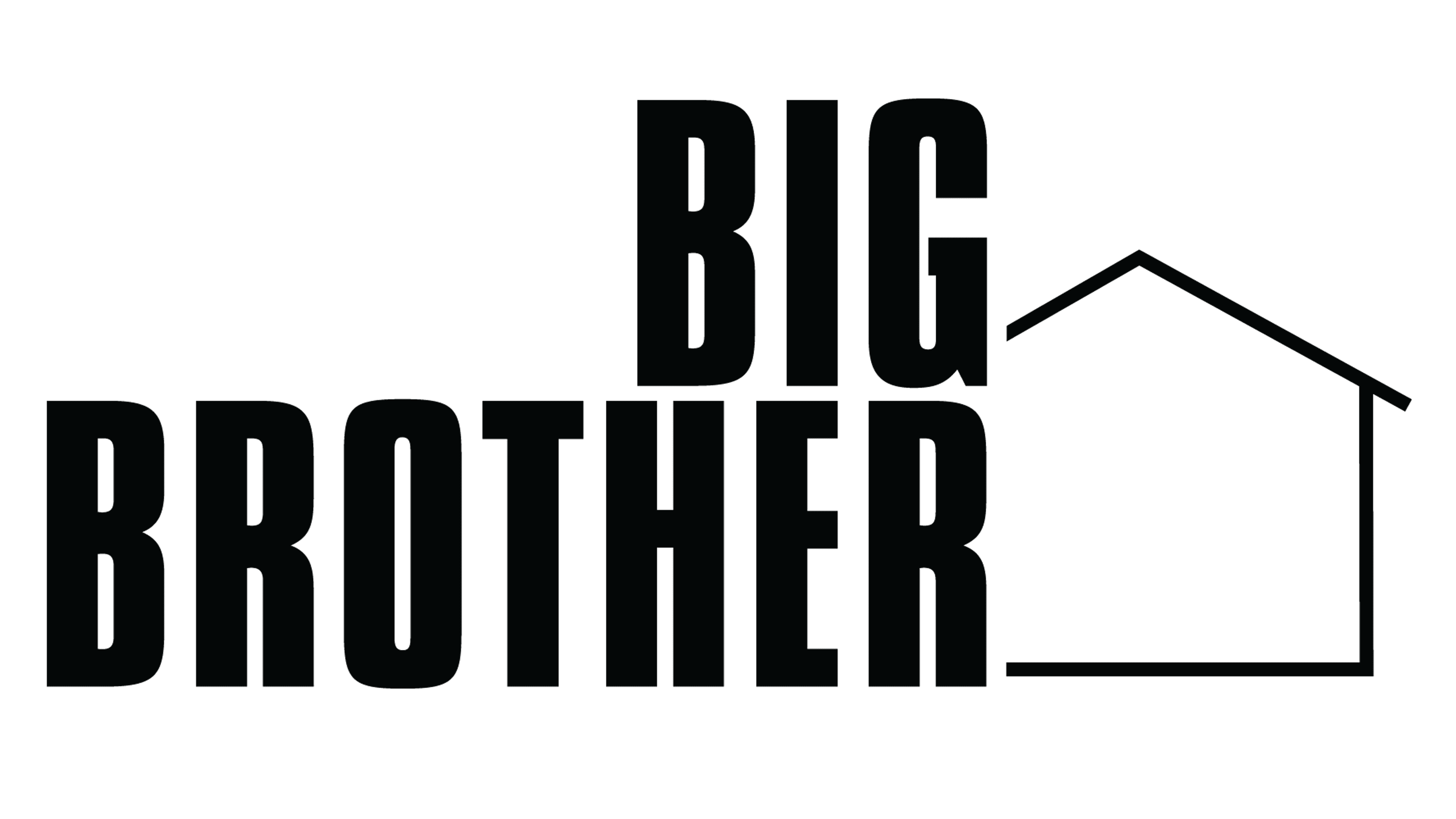
2020 – 2024
![]()
The redesign of 2020 has kept the blue and silver color palette of the Big Brother visual identity but switched the shade of blue to a lighter one. The composition was also changed, and now the name of the reality show was set in large voluminous characters placed under an angle to each other and “covered” with a straight double roof.
2024 – Today
![]()
In 2024 the logo of the show was changed again. The roof or any other elements, resembling a building or a house, were removed from the composition, however, a new signifier was added: a camera lens, which replaces the letter “O”. As for the other characters, they are three-dimensional and executed in a geometric sans-serif typeface with silver bodies, and bright blue edges and shadows.
Font and color
The bold yet slightly narrowed uppercase lettering from the primary Big Brother logo is set in a custom three-dimensional typeface, which has somewhat in common with such commercial fonts as OTC Underground, Juvenilla, or OT Julietta, but with significant modifications of some contours.
As for the color palette of Big Brother, since 2020 it has been based on a combination of blue and silver, which looks bright, and progressive and is often used by TV programs, as looks good on a TV screen.


