Marvel’s Moon Knight is the name of a miniseries tv project, launched on Disney Plus in 2022. The series is based on the Marvel Comics of the same name and tells a story of a former Marine suffering from a dissociative disorder. suddenly gains the power and strength of the Egyptian Moon God.
Meaning and history
Marvel’s Moon Knight is a series about a mercenary whose life has changed drastically after an archaeological expedition in Egypt. The former Marine officer suddenly gains the power of the Egyptian god of the Moon, and here everything started.
Borrowing a white robe from the statue of an Egyptian god and calling himself the Moon Knight, Mark Spector (the main character of the series) took up the fight against crime to atone for the sins of the past. Suffering from a split personality, Mark was aided by two of his most formative personalities: producer Stephen Grant and cab driver Jake Lockley.
Moon Knight appeared as a Marvel character in 1975. As any self-respecting superhero should, for the time being, Mark Spector was a normal human being. His father was a rabbi who had escaped the Nazi terror in Europe. Mark chose a military path, which ended up with him becoming a mercenary.
Marvel Studios’ desire to make a TV series was reported back in 2006. In 2008, writer John Cooksey said he was willing to work on the project, but it wasn’t until 2019 that it was revealed that a series about a hero who becomes unstoppable by moonlight would be released on the Disney+ platform. The world premiere of the series took place in March 2022.
What is Marvel’s Moon Knight?
Marvel’s Moon Knight is the Marvel comics-based tv series, launched on the Disney solid channel in 2022. The series tells the story of Mark Spector, a former Marine officer, and a mercenary, who got his super abilities from an Egyptian god.
As for the visual identity of the Marvel’s Moon Knight series, it was initially designed in 2019, when the producers started working on the project, but by the date of the series release, the logo was slightly refined.
2019 – 2022
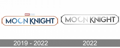
The original Moon Knight logo, designed in 2019, featured a solid black background with a shiny gradient lettering in the uppercase of a geometric sans-serif typeface, set in metallic blue, and enclosed into a thin light frame, stretched horizontally and rounded on the sides. The logotype was accompanied by the red-white-black Marvel insignia, set on the top part of the badge, in a small size. The main feature of the logo is the second “O” in the “Moon”, stylized like a moon.
2022
The redesign of 2022 has cleaned up the contours of the Moon Knight logotype, switching the color of the letters to cold silver metallic, with all the blue shades removed. The black banner behind the inscription became thinner and repeated the contours of the internal frame from the previous version. As for the Marvel Studios badge, it got more visible, as now was set against a white background.
Font and color
The bold uppercase inscription from the primary Moon Knight logo is set in a sharp and brutal geometric sans-serif with straight lines and angles of the letters, set in the medium-weight bars. The closest fonts to the one, used for the Moon Knight insignia, are, probably, Gacor Regular and KAPITAL Demibold, but with the contours of the characters refined.
As for the color palette of the Moon Knight visual identity, it is set in glossy silver and black, with a small red accent of the Marvel Studio’s signifier. The combination of metallic and plain black represents the “moon” side of the comics from its better side, evoking a sense of cold, danger, and power.


