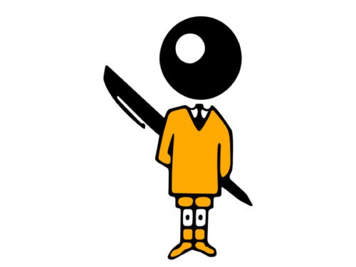
The Bic logo is yet another example of outstanding brand consistency. The funny guy with a ballpoint pen ball instead of the head has been part of the emblem for more than half a century.
Meaning and history
Société BIC S.A. was established in France in 1945. The company works in the lower end of the market of disposable products, from lighters and pens to razors and mechanical pencils. As Bic mostly sells cheap products, its brand is often ignored in spite of the fact that it does its job perfectly well.
The logo consists of a stylized boy and the wordmark.
The boy symbol
The ball-headed boy was created by Raymond Savignac, a graphic designer from France, in 1961. It was part of the advertising campaigned developed for the company’s new ballpoint pen. The ad put an emphasis on the new pen’s distinctive feature, the tungsten carbide ball. Also, by depicting a boy, the designer wanted to catch the eye of schoolchildren. Savignac stayed with the company for more than 20 years and created over 15 posters for it.
Wordmark emblem
The rhomboid shape with curved corners was first used on the logotype in 1950, when the famous Cristal pen was created. In the earliest version of the emblem, the background was red, while the letters were white.
Font
The Bic logo was hand drawn specially for the company, it does not use any of the existing typefaces.
Color
The color scheme includes black and orange (Pantone 1235C) as the dominant colors, while white is a secondary one.


