Brita is the brand of a water-filters manufacturing company, which was established in 1966 in Germany. Today the company has its production facilities in Europe and Asia and distributes its filters in almost 70 countries across the globe.
Meaning and history
BRITA got its start in 1966 when its founder Heinz Hankammer from Taunusstein, Germany, and his team began working on the first filter jug. The company got its name thanks to the owner’s daughter (named Britta). The first example of the water purification system was introduced to the market in 1970.
The company’s rapid development led to Hankammer becoming the first German to win the International Entrepreneur of the Year award in 1997.The company’s equipment has repeatedly won significant awards, which guarantee the quality and reliability of Brita water filters. One of them is the “Design Awards”, which confirms active development, improvement of Brita filters and introduction of the latest technologies in their manufacture.
What is Brita?
Brita is the name of a German company specializing in water purification systems. Founded in the middle of the 1960s, today Brita is the market leader in portable water purification systems and filters for home use, with its products distributed all over the globe.
1966 – 2010

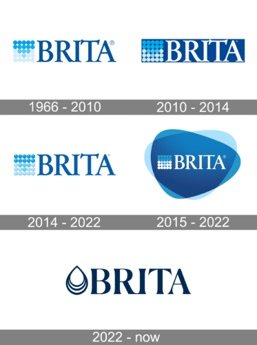
The first Brita logo was created in 1966 and featured a bright and delightful combination of the uppercase logotype in an elegant and sleek serif typeface, and an emblem drawn in gradient shades of blue and reflecting the purpose of the brand. The emblem asked a square structure formed by twenty-five circles, which were blue at the top and became light gray to the bottom.
2010 – 2014
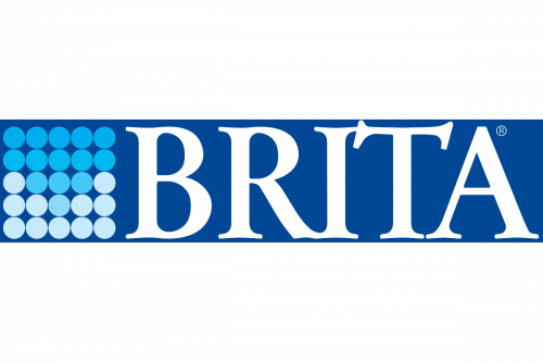
The first redesign of the logo happened only 44 years after the first logo introduction, and not many changes were done. The most visible thing that was refined was the emblem, which got its circles drawn in a three-dimensional way now. So more gradient shades and glossy texture. The logotype gained shadow, which also added volume and dynamics to the brand’s visual identity, and the background was switched from white to light blue.
2014 – 2022

The three-dimensional “drops” of Brita are now placed on white again and the calm yet intense blue logotype in a smooth and sophisticated serif typeface got its shadow removed. The logo looks minimalist yet modern and very professional.
2015 – 2022
The Brita visual identity is memorable and meaningful, a perfect representation of the company’s nature and activity field.
The logo, composed of a wordmark and an emblem is executed in a blue and white color palette, where the blue is performed in several shades. It makes the logo look vivid and evokes a happy feeling.
The Brita wordmark in all capitals is written in an elegant serif typeface, with diagonal serifs of the “T”’s horizontal bar. It adds uniqueness and individuality to the logo.
The Brita emblem is a matrix of 25 solid dots, forming a square. Colored in gradient blue from a dark shade to white moving from the upper edge to the bottom, it shows the water filtration process.
The blue and white color palette of the Brita logo reflects the professionalism of the company, emphasizing its reliability and authority and evoking a sense of confidence and safety.
The Brita logo is fresh and crispy, it is sophisticated and timeless, a great example of visual identity design.
2022 – Today
The redesign of 2022 has kept the style of the lettering from the previous Brita badge, but switched the color palette to a darker shade of blue, and replaced the emblem with the new one — a contoured drop of water with a triple arched bottom. All elements of the badge are set in one plain shade on a clean white background, looking very reliable and professional.
Font and Color
The elegant yet stable lettering from the primary Brita badge is set in the uppercase of a sophisticated serif typeface with the serifs on the horizontal bar of the “T” drawn diagonally. The closest fonts to the one, used in this insignia, are, probably, Goudy Trajan Pro Bold, or Pastonchi Pro Titling, with some minor modifications of the contours.
As for the color palette of the Brita visual identity, it is based on shades of blue and white, the colors associated with purity and freshness, and the first shades to represent water and its cleanliness. This palette represents the field of the company’s activity and evokes a sense of reliability and quality.


