Ben 10 is the name of a popular animated series for kids, which was released in 2005 in the United States. Today the show is broadcasted worldwide and expanded its franchise to not only tv-series but also magazines and video games.
Meaning and history
The visual identity of the super-popular franchise is all about the space, as the main character, Ben Tennyson, is able to turn into aliens with the help of a special device, and this is what the whole Ben 10 is about.
2005 – 2008
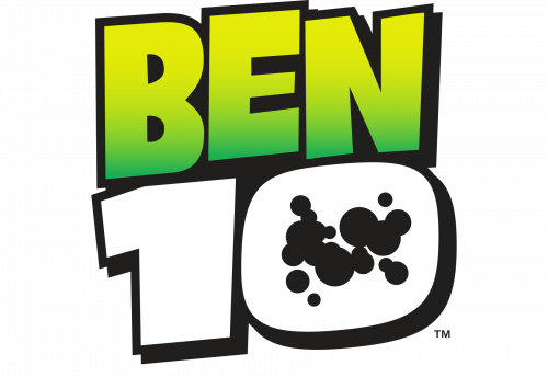
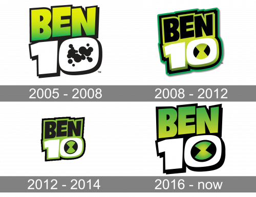
The initial emblem of Ben Ten was designed in 2005 and looked strong and professional from the beginning. The concept of the visual identity hasn’t changed much since the first logo, which was composed of a gradient green uppercase “Ben” inscription set above the bold white “10” in a black outline. The circle on the zero was replaced by several black splashes.
2008 – 2012
The redesign of 2008 added more brightness and lines to the logo. The badge was now set in black and white and placed over a gradient green background, which repeated the contours of the logotype and was outlined in green and black. As for the splashes, they were replaced by a green and black circle with the geometric symbol, reflecting the essence and plot of the franchise.
2012 – 2016

In 2012 the Ben 10 logo is being refined again. Now it is flat, because of the use of one green shade, and it makes the image more minimalist, yet adds modernity and style. All other elements remained almost untouched, just got their contours cleaned and strengthened.
2016 – Today
The logo, which was first introduced in 2005, has been slightly changed throughout the years, but not much, and all the changes were mainly about the lower level of the emblem, the “10”.
The Ben 10 logo is composed of an ExtraBold green and yellow gradient “Ben” lettering in capitals, which sits on a white “10”. Both parts feature a thick black outline and a shadow, also in black, which makes the whole badge look lighter and more distinct.
Inside the zero, there is a black and gradient green circle, which balances the look of the emblem. In the original version, this element was replaced by numerous black dots, but with the addition of green and yellow gradient, it became more harmonized and cool.
The Ben 10 logo is instantly recognizable all over the world not only because of the incredible popularity of the franchise but also due to the use of massive figures and a very “alien” color palette, which also looks progressive and futuristic.


