

![]() National Geographic Logo PNG
National Geographic Logo PNG
The National Geographic logotype was developed by the New York-based brand design agency Chermayeff & Geismar. The major challenge of this task was that NatGeo is an institution with an extremely diverse variety of functions, from environmental conservation to promoting the appreciation of history. So, it needed the emblem that would fit any of the company’s incentives or programs.
Meaning and history
![]()
The National Geographic Channel visual identity hasn’t changed much since the introduction of its logo in 1997, just the typeface was redesigned and the four versions of the NatGeo logo have been switching between those two fonts.
1997 – 2001
![]()
The National Geographic Channel logo from 1997 featured an iconic yellow rectangular frame placed on the left from the wordmark in three levels. The inscription in all capital letters was executed in a classic and elegant serif typeface with straight bold lines and sharp yet distinct serifs. The font was pretty close to Palmstar Regular and Transcend SemiBold.
2001 – 2005
![]()
The redesign of 2001 added gray color to the National Geographic Channel and switched from the serif typeface to a clean and modern sans-serif. The composition remained untouched — the three-leveled wordmark on the right from the yellow frame, though the new style of the lettering and the “Channel” in light gray made the whole image look lighter and more welcoming.
2005 – 2016
![]()
In 2005 the company decided to get back to the serif elegance, though writes the “Channel” part in a bold capitalized sans-serif, separating it from the main wordmark with a yellow horizontal line. This version of the logo stayed with the brand for more than ten years and was an example of a good balance between styles, thicknesses, and colors.
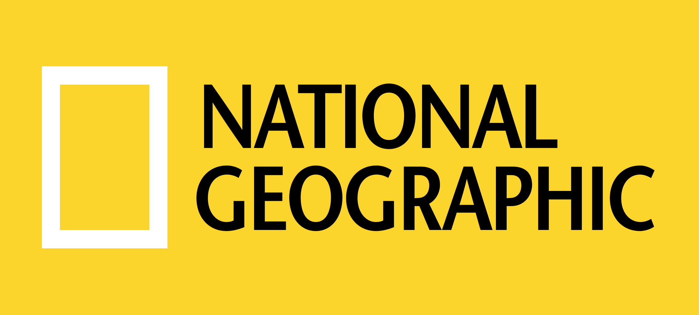
2016 – Today
![]()
The current National Geographic logo was designed in 2016, basing on the version from 2001, but with a simplified wordmark and color palette. Today it is a yellow rectangle on the left of the two-level wordmark, executed in black capitals letters of a stylish contemporary sans-serif typeface, which is very similar to ITC Stone Humanist Pro SemiBold.
Original symbol
 From 1888 to 1967, the National Geographic Society used a completely different emblem. It featured a depiction of the Northern hemisphere encircled with the name of the organization and the lettering “Incorporated in A.D. 1888” in white capital letters.
Font
![]()
The emblem features a clear sans-serif type called NatGeo SemiBold. All the letters are capitals.
Color
![]()
Some sources mention that yellow as a part of the National Geographic logo symbolizes the sun, which shines in every corner of the globe. The palette also includes black for the background and white for the letters.


