Beko is a Turkish brand of household appliance manufacturing company, which was founded in 1955 by Vehbi Koç and Leon Bejerano. The brand is a part of Koç Holding and is one of the largest European producer of consumer electronics.
Meaning and history
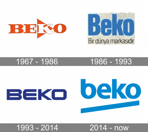
The Beko visual identity has no rich history, as there was only one major logo redesign, held by the brand in 2014. Yet both its versions are recognizable and memorable, perfectly representing the brand and its trustworthiness, loyalty, and values of high quality in production and design.
What is Beko?
Beko is the name of a Turkish company-manufacturer f home appliances, which was established in 1955, and today has its low-budget products sold all over the globe, but mainly in Russia and Europe. The brand produces almost the whole range of consumer electronic goods, including refrigerators, washing machines, and small kitchen appliances.
1967 – 1986
The Beko logo, introduced at the end of the 1960s, featured a bold serif logotype, executed in bright orange and white color palette, and complemented by a geometric graphical element, the solid orange triangle with its peaking pointing to the right. The triangle was placed behind the letter “K” of the wordmark, making the letter white, while all other characters boasted a bright orange shade.
1986 – 1993
The redesign of 1986 simplified the Beko edge and made it stricter. The new concept was built around a bold blue sans-serif inscription in the title case, set above the thin black lettering with the motto of the company. The font featured heavy narrow letters, which looked fresh and confident due to the chosen shade of blue.
1993 – 2014
The very first Beko logo was introduced in 1967 and stayed with the brand for almost fifty years. It was a very confident and simple logotype, executed in a smooth and wide sans-serif typeface with rounded outer angles and sharp inner ones. The inscription looked powerful and solid, and its dark blue and white color palette evokes a sense of expertise, seriousness, and responsibility.
2014 — Today
The redesign of 2014 changed a Beko design concept, softened it, and made it friendlier. The massive solid shapes of the previous version were replaced by the lowercase inscription with straight diagonal underline. The lettering is executed in a modern sans-serif typeface with rounded contours and straight cuts of the letter edges. It looks welcoming and kind, reflecting freshness, youthfulness, and progressiveness, and the diagonal underline only adds to all these feelings. Its upright direction represents growth and development, showing the brand as the one that doesn’t stay in one place, and is constantly evolving and looking for new technologies and designs to satisfy the needs of its customers.
Font and color
The lowercase light blue logotype of the Beko brand is set in a modern sans serif typefaces, which is pretty close to such fonts as Quebec Serial Heavy and SST Heavy, but with the contour of the “B” softened and modified.
As for the color palette of the Beko badge, it is set in the light shade of blue, which looks vivid and kind, evoking a sense of a professional approach to the production of goods, and attention to the needs of the clients.


