Barilla is an Italian brand of pasta and canned food manufacturer, which was founded in 1877 by Pietro Barilla. Today the brand is the biggest manufacturer of various types of pasta and sauces on the world.
Meaning and history
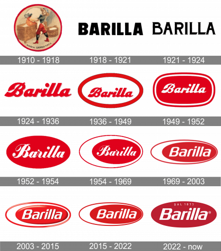
In 1877, Pietro Barilla opened a bakery shop in Parma, Italy.
1910 – 1918
In 1910, the company started making egg pasta.
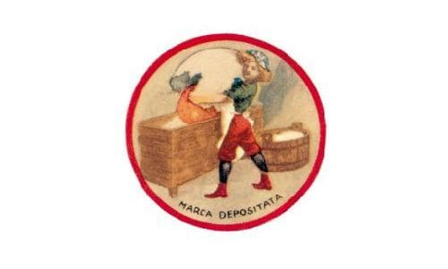
The original Barilla logo was drawn by Ettore Vernizzi. On the logo, you could see a baker’s apprentice pouring a huge egg yolk in a kneading trough containing a heap of flour.
The picture remained almost unchanged up to the 1930s, while the word “Barilla” was redrawn from scratch almost every year or two.
1918 – 1921
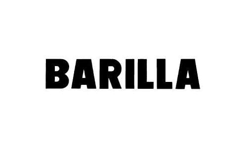
The logo for the brand, introduced in 1918, featured a bold and strict black logotype in the uppercase, executed in a sans-serif typeface with clean contours of the massive letters and straight lines and cuts. The emblem looked very serious and stable, evoking a sense of professionalism and authority.
1921 – 1924
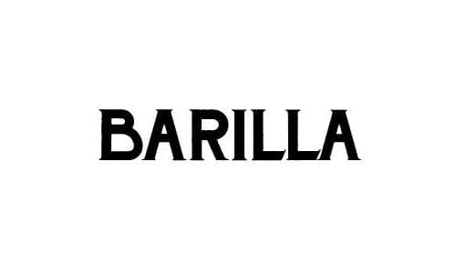
In most cases, the name of the brand was given in block capitals, bold or light, with or without serifs. One of the 1922 versions showcased elaborate curls. There were also versions where letters were linked, like in handwriting, and wordmarks going up.
1924 – 1936
The colors ranged from brown to white on the blue background, blue or red on the white background, as well as black.
A calendar from 1935 still featured the original logo with the baker’s apprentice.
1936 – 1949
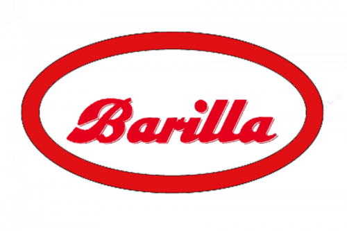
Giuseppe Venturini got rid of the boy and left only the wordmark. He placed it inside the ellipsoid that has been present on the logo ever since.
The shape of the ellipsoid has varied.
1949 – 1952

In 1949 a friendly and bright red and white badge was created for the iconic Italian brand. It was a horizontally stretched rectangle with softened rounded angles and upper and bottom sides slightly arched from the center. The badge had a double white and red outline and a custom cursive lettering in bold white shapes.
1952 – 1954
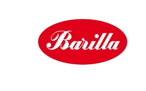
When the company discontinued its bakery business, it hired Erberto Carboni, an Italian architect and designer, to redraw the logo.
This version featured a neat oval housing the name of the brand in a script inspired by handwriting. While the script resembled the one the previous logo, it was, in fact, different, more refined.
1954 – 1969
Carboni slightly tweaked the design adding a larger oval positioned asymmetrically.
The logotype has been interpreted as either the egg white and yolk or the fingernail.
1969 – 2003
Lippincott & Margulies (London) designed a more minimalist version. They flattened the ellipse and replaced the handwritten script by a sans serif type. The design has remained almost unchanged ever since.
2003 – 2015
The company added some depth to the logo with the help of the gradient, white highlights, and dark shades.
2015 – 2022
The Barilla logo, introduced by the brand in 2015, is fully based on the previous version, though is flat and had its red shade brightened up. The oval badge looks minimalist yet powerful and shows the company’s value of its roots and willingness to progress and grow.
2022 – Today
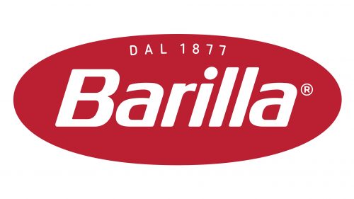
The 2022 emblem is the same red oval from the previous design, just without the white bits to the left and the additional red outline. The colors were darkened, and the font became a bit more angular. Furthermore, a little ‘dal 1877’ inscription appeared along the top edge, written in thin, white letters.
Font and color
The italicized sans-serif logotype of Barilla is executed in a modern typeface with rounded angles of the letters and smooth neat lines. The typeface of the brand is very similar to such fonts as FF Signa Round Bold Italic and Neuropa Medium, but with come lines modified.
The red and white color palette of the Barilla visual identity is a representation of the passion, love, and professionalism of the Italian company and its values of the customers’ happiness and well-being. The badge looks great in any surroundings and gives a great contrast when placed on the dark blue packaging of the brand’s products.


