 Bad Robot Productions Logo PNG
Bad Robot Productions is an American film and television production company led by J.J. Abrams. Founded in 2001, its name is drawn from the playful animation shown at the end of its productions which features a shout of “Bad Robot!” Not just confined to television and film, the company operates across various platforms, from movies to video games. Based in Santa Monica, California, Bad Robot has created some remarkable works, aligning with networks like WarnerMedia and extending its footprint across the entertainment sector.
Meaning and history
Established in 2001 by filmmaker J.J. Abrams, Bad Robot Productions stands as a hallmark in the entertainment industry. Recognized for its creative genius, the company has played pivotal roles in renowned franchises such as “Star Trek,” “Star Wars,” and the TV series “Lost”. Their signature production animation – a paper-cut-out-style robot with the voiceover “Bad Robot” – is instantly recognizable to fans worldwide. Currently headquartered in Santa Monica, California, the company continues to expand its horizon, partnering with leading networks and studios, reinforcing its reputation for producing riveting content.
What is Bad Robot Productions?
Bad Robot Productions is an American film and television production company established by J.J. Abrams in 2001. Renowned for its role in major franchises like “Star Trek” and “Star Wars,” it has become a significant force in the entertainment world, based out of Santa Monica, California.
2001 – 2008
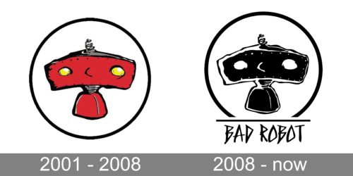
Enveloped in a simplistic oval, the first logo is a delightful interpretation of a whimsical robot. Its dominating red hue immediately captures attention, a color often associated with passion, energy, and action. The robot’s rectangular head, with its symmetrically placed, round, glowing yellow eyes, emanates an aura of curiosity. The small, coiled antenna perched atop gives it a vintage touch, reminiscent of the classic representation of robots from yesteryears. This endearing figure stands against a stark white background, which only amplifies its prominence. The overall design is a harmonious blend of minimalism and nostalgia, evoking a sense of playful innovation.
2008 – Today
The second logo is a stark contrast to the first, both in color palette and emotion. Rendered in monochromatic black and white, this logo exudes a more mature and sophisticated vibe. The robot’s head, distinct with its elongated rectangular shape, is punctuated with two oval eyes, their crescent glimmers indicating a mischievous spirit. A coiled antenna, similar to the first design, adorns the top. Below the figure, the words “BAD ROBOT” are boldly inscribed, reinforcing the brand’s identity. The capital letters, sharp and unyielding, stand as a testament to the brand’s confidence and strength. The entire design, encased in an oval, is a modern take on a timeless concept, merging the past’s charm with today’s edginess.


