

![]() Star Trek Logo PNG
Star Trek Logo PNG
Meaning and history
![]()
The history of the Star Trek Logo is quite lengthy and varied. Since the makers of the first movie came up with the fantastic world, it has changed many logos. However, they still have something in common.
First, it is the stylized ‘A’, which is more like a check mark turned upside down. There were times when the symbol featured an asterisk and when it was presented as a kind of dash placed between the Star and the Trek, or even was used separately as the project’s symbol.
Symbol

The symbol is quite multifaceted. Being independent, is symbolizes the movement of the Enterprise starship across space and the ship itself. Meanwhile, being confined in a circle, it is filled with the energy streaming in from the infinite Universe and unknown space, which the courageous space explorers are trying to conquer.
Also, the symbol’s popularity was proved by an exclusive experiment carried out by IBM, a leading computer technology company. With the help of a huge microscope, the Star Trek logo was composed of tiniest carbon atoms. The experiment qualified for inclusion in the Guinness Book of Records.
Emblem

The Star Trek emblem is a much demanded element of the pop culture. Fans of the movies and other licensed media products show great interest in other items featuring the emblem. These include T-shirts, caps, pens, souvenirs, etc. By preserving the basic element in every next logo version, the project managers emphasize the continuity of stories relating to Star Trek.
![]()
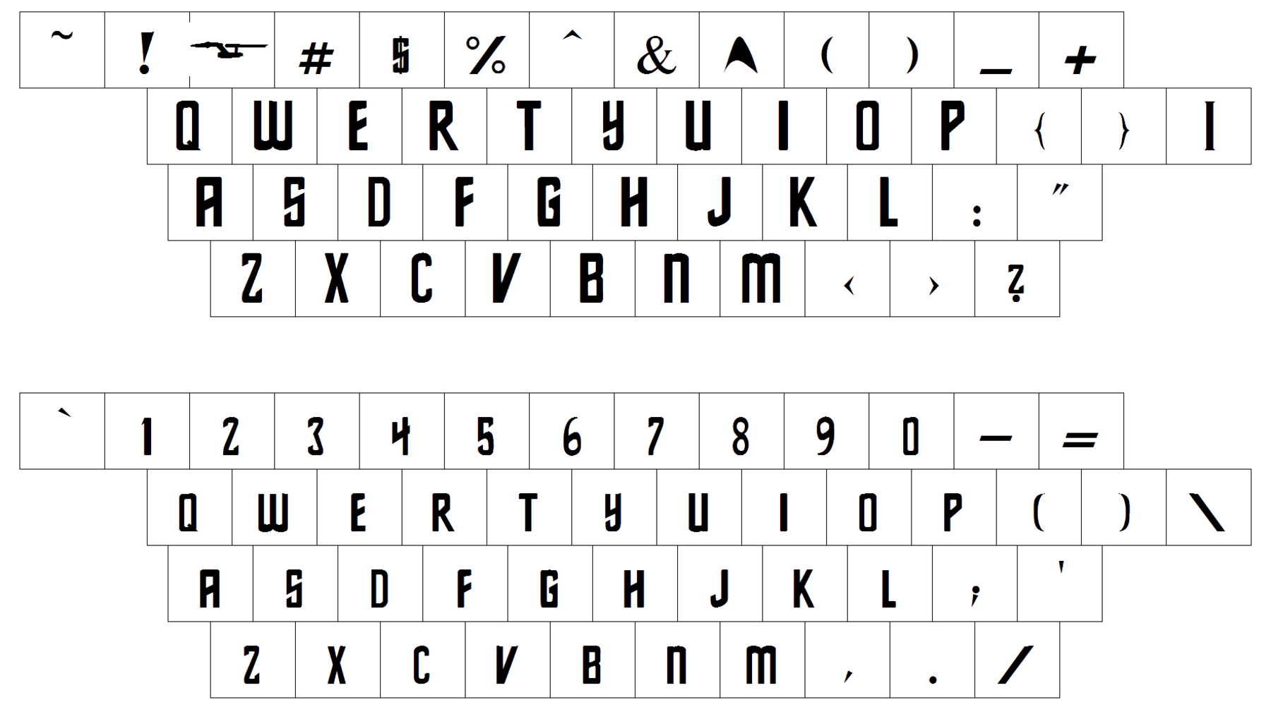
Font
Who designed the Space Force logo?
The Space Force logo, introduced in 1961, and based on the seal, used by the American Army Air Forces in the 1940s, was designed by the GSD & M marketing bureau, which also worked as the main advertising agent for the Air Force Department.
What is the meaning behind the Star Trek logo?
The stylish and unique Star Trek logo looks very cool and modern, based on a graphical element, resembling a rocket and the letter “A” at the same time. The spacecraft badge reflects the essence and purpose of Star Trek, as well as symbolizes movement and speed, along with outer space in general.
Why does the Space Force logo look like Star Trek?
It’s not The Space Force logo looking like the Star Trek one, but vice versa, the Star Trek badge repeats the design of the Space Force emblem, as the Space Force insignia was designed in 1961, and the franchise’s badge saw the light five years after, in 1966.
What does the “A” stand for on Star Trek uniforms?
The capital “A”, set on the uniforms of staff in the Star Trek franchise, symbolizes the affiliation to the Enterprise spacecraft crew, and the letter design varies depending on the staff rank.


