Sky is the name of one of the largest British broadcasting companies, which was established in 1990. Today, the company is considered to be the most popular provider of pay-per-view content, with an audience of almost 13 million around the UK. Sky is also engaged in the providing of internet and mobile services.
Meaning and history
Sky is a large company, which is engaged in different media directions and has several tv-channels under its wing. Compared to other cable broadcasters, Sky is considered to be classics, and its visual identity has always had to be very thoroughly designed and thought out. The Sky logo was redesigned many times throughout the years but always kept on the boundaries of one style and one main element — the logotype in the lowercase.
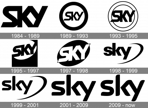
1984 – 1989
The original Sky logo was created in 1984, right after the rename of Satellite Channel (the initial naming). It was stylized black lettering in a fancy custom sans-serif typeface with all the letters connected due to elongated lines of bold smooth letters. Along with the sounded angles of the “S”, the inscription featured sharp and straight cuts of the bars, which added balance and progressiveness to the simple concept of the emblem.
1989 – 1993
The redesign of 1989 was held by Harry Marks Pacific Data Images agency, which decided to keep the original logo, but made the lettering smaller and placed it inside a bold black circular frame. The thickness of the frame was almost twice more than the base of the logotype, which added solidity and power to the image, and also made the placement on various backgrounds and surfaces easier.
1993 – 1995
In 1993 the Sky logo was refined by the Novocom design bureau. It was still lettering in a circular frame, but the logotype was enlarged and the bold frame turned into a light double outline one. The inscription was now overlapping the inner part of the frame with two tails — of the “S” in the bottom left part and on the right with the upper right corner of the “Y”.
1995 – 1997
Novocom introduced a modernized version of the Sky visual identity just Teo years after the previous redesign, in 1995. The bold black logotype was slightly stretched horizontally and placed on a white oval, set on the upper left part of the solid black square. It was the brightest and the boldest of all the emblem versions created until that year, but again, only stayed with the company until 1997.
1997 – 1998
The angle of the inscription got smaller and the colors were reversed in 1997. That was the first time, when the iconic Sky logotype was executed in white, and placed on a black background, which had a shape of horizontally and slightly diagonally stretched oval. The letters “S” and “Y” we’re overlapping the edges of the oval, just like on the version of 1993, but with the sharper corners.
1998 – 1999
The Sky logo from 1998 was created by Pittard Sullivan and showed the new image of the company. The black logotype was back but redrawn in a new typeface — a more traditional in shapes and lines, Univers Black. It was set on a transparent background and accompanied by a delicate black orbit on the bottom right part of the badge. This was replacing all the circular frames or the oval from the previous badges, keeping the recognizability but elevating the whole look.
1999 – 2001
The typeface of the Sky logotype was changed in 1999 to a smoother one. The sharp angles and straight cuts of the letters from 1998 were all softened and rounded, while the orbit, or the swoosh, remained untouched. The additional colored logo was also used by the company during these two years — the emblem in a blue-yellow-white tricolor.
2001 – 2009
The logo, designed in 2001 stayed with Sky for almost eight years, which could be considered as the record. It was not only the most long-lasting but also the simplest logo of all ever created before. The badge featured only a smooth logotype in a custom sans-serif typeface, placed on a transparent background. The orbit was removed and the letters in the inscription became larger, with their bars bolder.
2009 – Today
In 2009 the Sky logo was refined again, this time by Miles Newlyn, who created a new custom typeface for the company, which is now known under the name Sky Text. The concept was taken from the previous version — a bold lowercase inscription with no additional, placed on a plain white background, and that is it.
Font and color
The custom typeface, used for the Sky Group logo, Sky Text, is based on some of the modern sans-serif fonts with smooth sleek contours and playful details. The closest fonts to it are, probably Beginner Bold and Auro Bold, which have the same arched cuts of the bars, though the contours of the letters were modified.
As for the color palette, there are two possible versions — traditional black lettering on a white background, which is a timeless powerful combination, and a bright and delightful version, executed in candy-color gradients from orange to purple. This palette makes the logo unique and memorable, showing the creativity and the variety of genres and sphere the company provides content on.


