Axonius is the name of a cybersecurity platform, which was founded in New York in 2017, by Avidor Bartov, Dean Sysman, and Ofri Shur. The platform provides its clients with a whole range of digital security services, including deep analysis and improvement of the security environment.
Meaning and history
Axonius is a platform, which helps its customers to manage their cybersecurity issues. From a cyber security perspective, the main focus tends to be on technology. Today the software, hardware, and information are central to the digital life of almost any business existing, and Axonius helps to improve the security environment and to make the digital content of their clients protected.
The company, established and based in New York, has a perfect reputation and is praised for its immaculate customer support. Axonius is always developing and growing, and being founded in 2017, in 2022 they already introduced the 4.0-f version of its Cybersecurity Asset Management solution.
What is Axonius?
Axonius is a cybersecurity platform, which helps its customers to uncover the gaps in their systems, improve the environment and manage the security solutions. The company was established in 2017, and by today has grown into one of the most reputable names in this segment.
In terms of visual identity, the cybersecurity company from New York uses bold and futuristic shapes for its logo, which is composed of a graphical part and the lettering. The graphical part of the primary badge can also be used on its own, as the company’s icon and signifier.
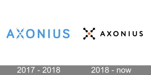
2017 – 2018
The design is sleek and modern, with the company name in a light blue, sans-serif typeface that conveys a sense of technological sophistication and clarity. The “X” in Axonius is stylized distinctly, with its two strokes crisscrossing and dotted with three small circles, which could represent digital connections or network nodes, emphasizing the tech-centric focus of the company. The use of blue in the logo is strategic; it’s a color often associated with depth and stability, reflecting the company’s aim to provide reliable and secure solutions in the complex world of cybersecurity. The simplicity of the design, coupled with the futuristic styling of the “X,” communicates Axonius’ commitment to innovation and its role as a harmonizer in the often-fragmented landscape of tech assets.
2018 – Today
The Axonius logo, designed in 2018, is composed of a graphical part, followed by the uppercase logotype. The emblem of the American cybersecurity company is a stylized letter “X”, formed by four black smooth elements, looking like two connected circles, and one solid orange circle in the center. The rays of the letter also resemble molecular connections.
As for the lettering part of the Axonius logo, it is set in stable and solid capital letters of a softened sans-serif typeface. The medium-weight black letters look very powerful despite the slightly rounded edges of the bars. The inscription is perfectly balanced, with enough space in and between the characters.
Font and color
The uppercase Axonius wordmark from the primary version of the company’s logo is set in a custom sans-serif typeface, with the clean contours of the letters and the straight edges slightly softened. The closest fonts to the one, used for the Axonius logotype, are Jackylin Black and Circle Rounded Alt Bold. The typeface of the company is something in between these two fonts.
As for the color palette of the Axonius visual identity, it is based on plain black and orange, where orange is only used for one element — a small solid circle in the center of the emblem, which makes it look like a target sign. And this makes sense, as the cybersecurity company provides its clients with targeted solutions for keeping their digital assets protected.


