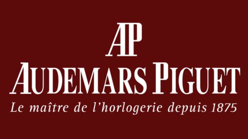
You can’t see anything apart from letters on the logo of the Audemars Piguet SA, a Swiss manufacturer of luxury mechanical watches. In spite of this fact, the emblem has a distinctive identity.
Meaning and history
The visual identity concept of Audemars Piguet has always been text-based and very traditional. The brand had only one major redesign throughout its long history, and it shows its value of legacy and traditions, which is one of the signature features of the Swiss companies.
1875 – 1950
The original version of the brand’s visual identity featured a delicate gold logotype in all capitals of a classy shadowed sans-serif typeface, placed under the double arch of the lettering and underlined by the “Brassus Geneve” tagline in a traditional sans-serif typeface. The “roof” of the emblem was composed of two levels — the long and enlarged “Manufacture d’Horlogerie Compliquee” as the mainline, and the small short “De Haute Precision” under it. The insignia looked very light and sophisticated, brilliantly representing the brand and its essence.
1950 – Today
The Audemars Piguet logo was redesigned in 1950, keeping the lettering as the main elements, but complementing it with a signifier — two merged “AP” letters in a narrowed bold serif font were placed above the wordmark. As for the “Audemar Piguet” lettering itself, it was written in all capitals of the traditional and elegant serif typeface, which looked strong and stylish in the new forest green color of the brand, and had its letters “A” and “P” enlarged. The “Le maitre de l’horlogerie Depuis 1875” tagline is written in thin smooth cursive.
Font
It is the typeface that makes the emblem stand out. While at smaller sized it may look like just another serif type, it’s much more than this. The unique wavy elements on the “D” and “E,” the elegant serifs, and the combination of thinner and bolder lines create a highly memorable style.
Colors
Typically, the Audemars Piguet logo is given in gold over a white or black background.


