

![]() Jaeger-leCoultre Logo PNG
Jaeger-leCoultre Logo PNG
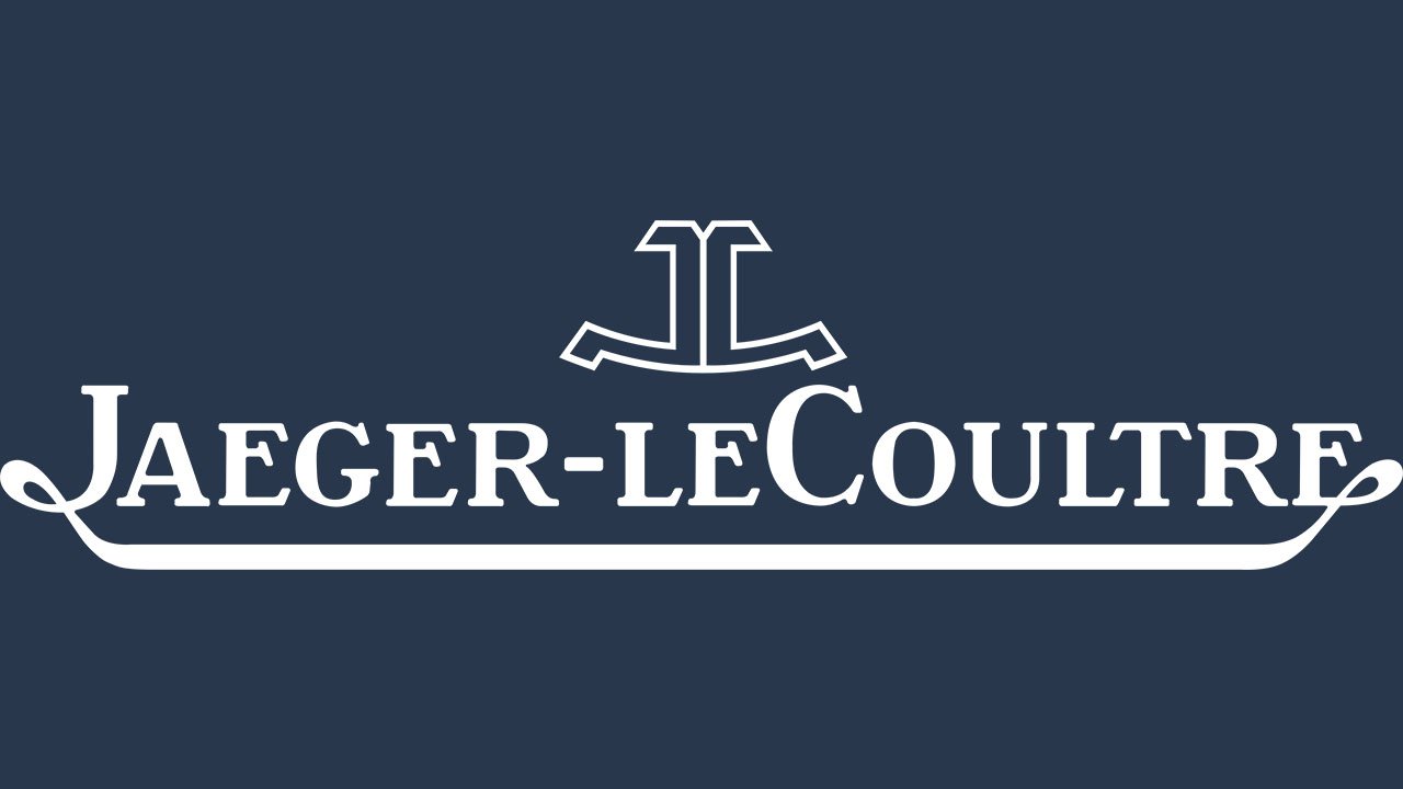
The logo of the watch brand Jaeger leCoultre has a stylish retro feel about it. And yet, it has inner energy and doesn’t look dated.
Meaning and history
The Swiss luxury watch and clock manufacture was established in 1833 by Antoine LeCoultre. Since 2000, it has been in property of the Swiss luxury group Richemont.
The Jaeger- leCoultre logo consists of two parts: an emblem on the top and the name of the brand below. Interestingly enough, the name of the brand is given in such a way that it looks more like a picture than text. The end of the initial letter, “J,” is extended to form a decorative loop stretching ahead to form an underline. Its end, in its turn, merges into a decorative loop on the last letter, “E.”
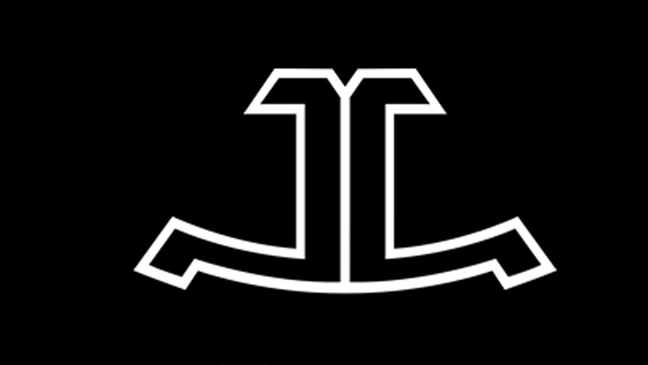
The emblem seen over the brand name features stylized letters “J” and “C.” They look like a mirror reflection of each other.
Font
Soft and stylish, the lettering on the Jaeger- leCoultre logo is a customized artwork created specifically for this luxury watch brand. One of its distinctive features is the combination of thin and thick elements, due to which the lettering adopts a retro look.
Colors
Simple as it is, the combination of black and white is an embodiment of timeless elegance and class. Depending on the color of the watch face on which it appears, the emblem may be gold, silver, white, grey, brown etc.


