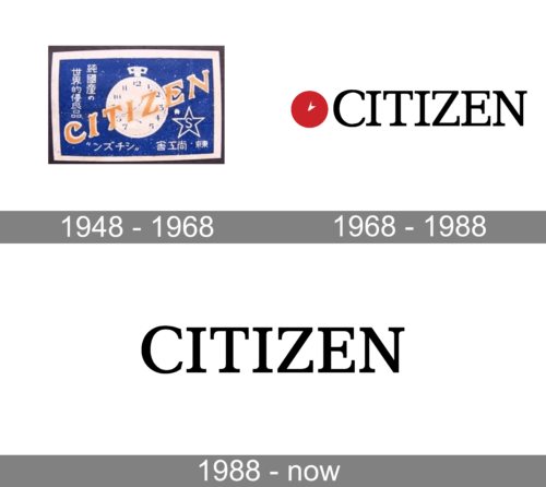
The evolution of the Citizen logo can be described as a way towards elegant simplicity.
Meaning and history

Citizen Watch Co., Ltd. is an electronics company established in 1930 by Japanese and Swiss investors. Today, it is primarily known for its watches.
What is Citizen?
Citizen is a Japanese global watch brand established in 1918. Renowned for its technological innovations, Citizen pioneered the Eco-Drive technology, which powers watches using light, and is known for its durable, high-quality timepieces.
1948 – 1968

The original logo contained a lot of details. The very wordmark already looked pretty elaborate due to the unusual ends of the glyphs. Behind it, there was the clock. Its hands and the numbers made the design even more cluttered. To make matters worse, there was a star and the lettering in hieroglyphs. The writing was white on the blue background.
1968 – 1988

This version was by far simpler. While the clock was still there, the numbers disappeared from it leaving only the hands, which looked plain. The type used for the word “Citizen” lost many of the picturesque details. It was now an elegant serif font. The palette included red and black on the white background.
1988 – Today

The design has grown even simpler. What is important, it has done so without losing its style and heritage. It still features a highly legible serif type. The proportions have grown slightly different (the glyphs are a bit wider). The difference in the thickness of the glyphs has grown smaller. And yet, the overall look of the letters has something in common with the previous version.
The clock disappeared from the Citizen logo leaving it easier to reproduce. The emblem, which is used as a compact representation of the logo, features the “C” in white inside a black box.


