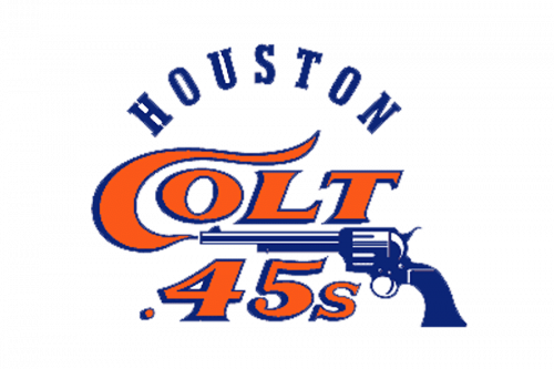
The Houston Astros have gone through a series of logotypes ranging from a comparatively simple wordmark to a rather complex emblem.
Meaning and history
The very first Houston Astros logo, which was adopted when the team was calledthe Houston Colt 45s,featured a blue gun. After the name was changed in 1965, the team switchedto the orange roundel emblem containingthe Astrodome stadium with baseballs orbiting around it. The word “ASTROS” was placed below. In 1977, the font and the color scheme were slightly modified.
What is Houston Astros?
Houston Astros is the name of a professional baseball club from the United States, which was founded in 1962 under the name Houston Colt. 45. The team got its current name in 1965, and today it competes in the Major League Baseball as a member of the West Division, with Minute Maid Park as its home arena and James Click as the general manager.
1962 – 1964

Back in the day, the team was known as ‘Houston Colt .45s’. The central piece in this earliest logo was a classic Colt Peacemaker revolver. They gave it a blue-and-white color scheme. Above and below, they wrote the team’s moniker in big orange letters. Interestingly, the ‘C’ was styled as a wisp of smoke coming out of the pistol.
The city name was put in an arch above the rest of the logo. The letters were blue and used a classic college serif.
1965 – 1974
Upon adopting the current name, the team introduced a new emblem. There was the Astrodome stadium reminding a hockey puck. Baseballs were orbiting around the building. The word “Astros” was given in a saturated shade of blue.
1975 – 1993
The overall style and structure remained unchanged. Yet, there were quite a few subtle modifications in the way the stadium, the team’s name, and the balls were depicted.
1994
After a complete overhaul, the Houston Astros logo adopted a new palette combining dark blue, gold, and white. The overall shape alluded to the Astrodome stadium. The name of the team in a dynamic italicized type was given inside, next to a star.
1995 – 1999
Due to the disappearance of the stadium shape the design grew simpler and easier to grasp. We should say, though, the word “Houston” was rather small and therefore legible only at larger sizes.
2000 – 2012
The italics were replaced by a stylish script imitating handwriting. While it looked elegant, there was nothing sporty about it.
2013 – Today
The letter “H” with an orange star in the background is the centerpiece of the Houston Astros logo. It is encircled by the full name of the team.
Evolution of the emblem
In 1994, a completely new design was adopted. It featured a shooting gold star and the wordmark inside a frame resembling Astrodome. The shooting star logo was modifiedin 1995 and 2000.
Current symbol
In 2013, the logo was heavily modified. Now, it is based on the letter “H” placed over the background representing an orange star. The star is encircled with the words “Houston Astros”. Also, there is a version of the symbol without the team’s name.
Font
The font on the Houston Astros logo has a lot in common with the Player Bold typeface created by Patrick Griffin and published by the Toronto-based independent font development studio Canada Type. It is a geometric serif typeface boasting excellent legibility.
Color
Navy blue, orange, and white, which are the three colors of the team’s official palette, appear on the logo together with a light shade of grey.
Houston Astros Colors
NAVY
PANTONE: PMS 648 C
HEX COLOR: #002D62;
RGB: (0, 45, 98)
HSB: (211, 100, 38)
CMYK: (100, 89, 34, 25)
ORANGE
PANTONE: PMS 158 C
HEX COLOR: #EB6E1F;
RGB: (235, 110, 31)
CMYK: (3, 70, 100, 0)
LIGHT ORANGE
PANTONE: PMS 1495 C
HEX COLOR: #F4911E;
RGB: (244, 145, 30)
CMYK: (1, 51, 100, 0)
What does Astro mean in Houston Astros?
The “Astros” part in the name of the professional baseball club from Texas, Houston Astros, is a tribute to the home arena of the team, the Astrodome, a famous stadium, where the Astros relocated back in 1965. This stadium is considered the Eighth Wonder of the World, as it boasts an incredible shade and futuristic design. The Astrodome itself is another tribute — the arena was named after the American space program.
Why did the Houston Astros change their logo?
The Houston Astros’ visual identity has been changed several times throughout the years, with the latest redesign held in 2013. The complete rebranding was the way for the club to show the new chapter in its history, and to reflect its willingness to develop, grow, fight and win. It is also a graphical representation of the club’s determination, and a tribute to the state and the city it plays for.
What is the Astros logo?
The logo of the Houston Astros features a modern and contrasting circular badge in solid navy blue, with a thick frame in a double orange outline, a three-dimensional orange five-pointed star in the center of the badge, overlapped by a massive white serif letter “H” in the uppercase. The white capital “H” looks stable and voluminous due to a thin light-gray outline. As for the framing, it is decorated by a medium-weight “Houston Astros” inscription in the uppercase of a college-style serif type.
What year did the Astros change their logo?
Houston Astros is a club with several redesigns of the visual identity. The logo of the club has been changed six times throughout the years, with the first refinement taking place in 1965, and the last one — in 2013.


