

![]() Nantes Logo PNG
Nantes Logo PNG
Nantes is the name of a French football club from the north of the country, which was established in 1943. Playing in Ligue 1, the team with Christian Gourcuff as a head coach is considered to be one of the strongest competitors in France.
Meaning and history
![]()
The Nantes FC visual identity has always been consistent in terms of theme and color palette. Its bright yellow and green logos, evoking a sense of energy and happiness, have been with the team since the very beginning, as well as the sea motive, as the clipper was the main symbol of the club until the last years.
1955 — 1961

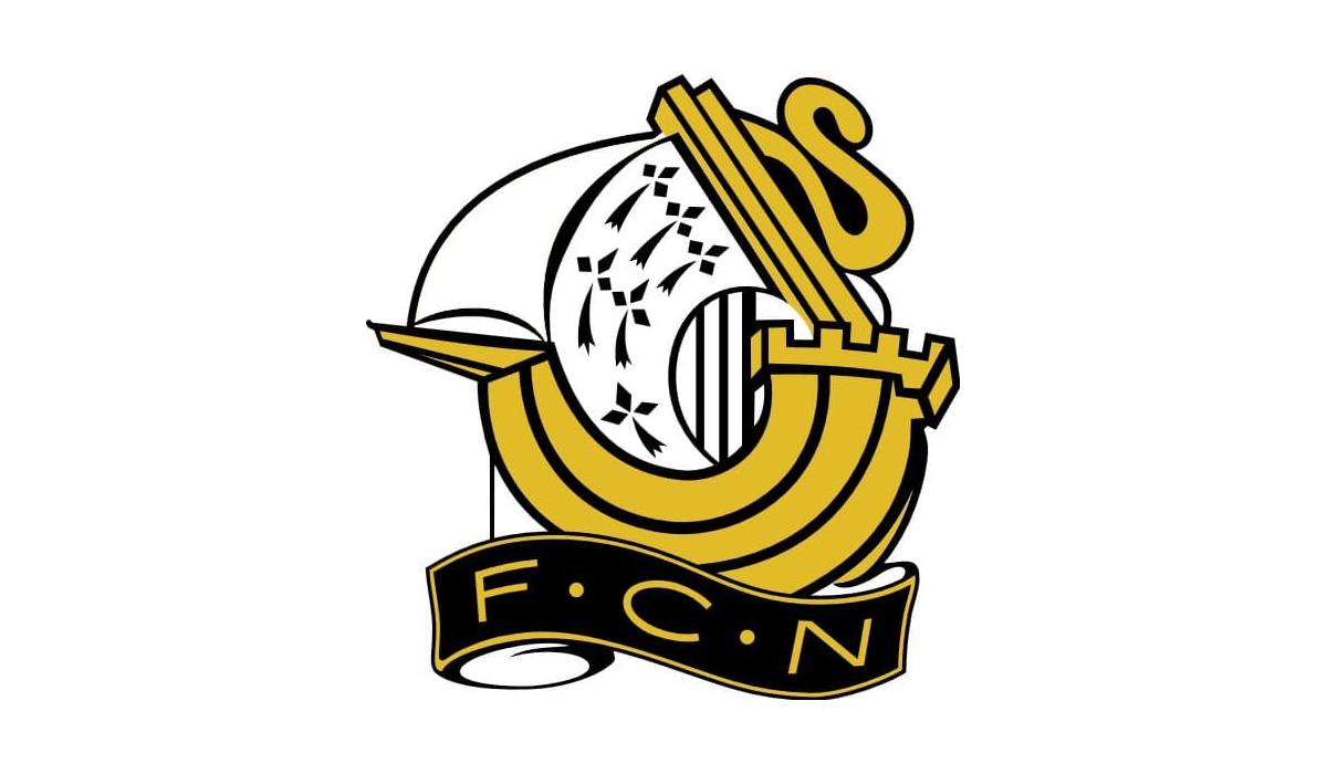
The Nantes logo designed in 1955 was composed of a strict octagon, which looked more like a square with its corners cut diagonally. The shield featured green and white colors and was outlines in yellow.
On the green part of the emblem, the yellow clipper was placed on the curved line, symbolizing the sea. The white line above it comprised five four-pointed stars, also in yellow. The top part of the badge was colored yellow and has a simple and clean black “F. C. N.” Lettering on it.
1961 — 1968

The emblem became a little narrower and the green color was replaced by a pale yellow in 1961. The five stars from the top of the badge were replaced by five abstract figurines, and the typeface of the inscription was now bolder and gained a thin black outline.
1968 — 1973
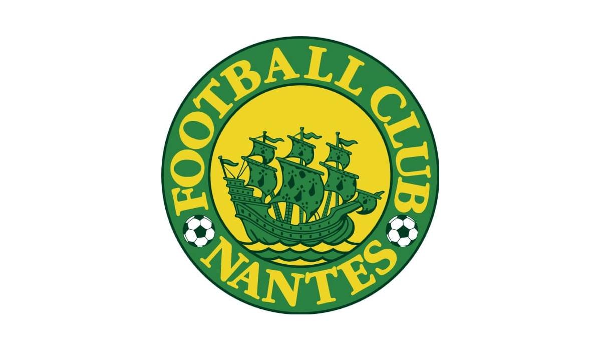
The green and yellow color palette come back to the club’s visual identity in 1968. Though the shape of the emblem was changed to circular, the composition remains the same — clipper is still the main part of the logo.
The bold serif wordmark is placed around the green perimeter of the emblem’s framing and has its “Nantes” part separated from “Football Club” by two black and white footballs.
On the clipper’s sails, there are six stylized symbols, resembling a cross, drawn in black. These “four petals” will later become the club’s official symbol and the most significant part of its visual identity design.
1973 — 1977
The completely new style of the logo was adopted by the club in 1973. Its new modern emblem was executed in black, yellow, and white and boasted all the main symbols of the team — the clipper and its sail’s ornament — but in a more contemporary execution.
The emblem featured no framing and had its wordmark simplified to three letters again. The “F. C. N” lettering in yellow was now placed on a black curved ribbon under the ship, and written in a thin and extended sans-serif typeface.
1977 — 1988
The circular badge from 1977 had its color palette switched to a darker and more intense one. The yellow ship on a green background looked sleeker now and has fewer accents than those from the previous versions. The thick yellow stripe above the clipper had five arrow-like symbols in green on it. Those were the same “four petals”, but now they got bolder and had no spaces between their parts.
1988 — 1997
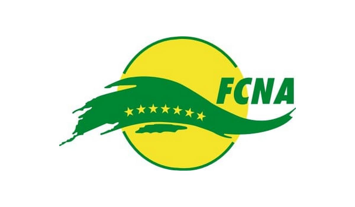
The first logo without a ship was created for the club in 1988. It was a bright yellow circle in a thin green outline and a wide green curved line, resembling a wave, where seven small yellow stars were placed.
The wave finished under the “FCNA” inscription in a bold and slightly italicized sans-serif with thick lines and distinct straight cuts.
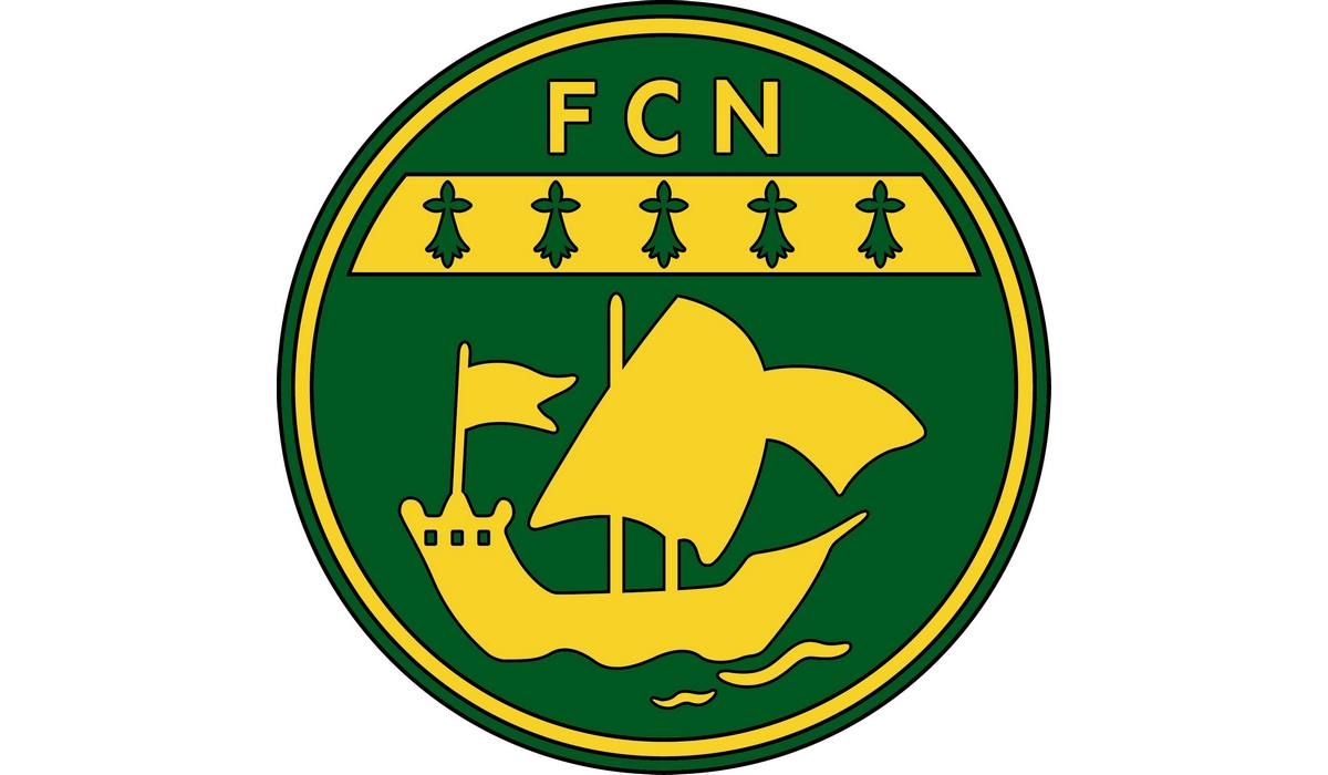
1997 — 2003
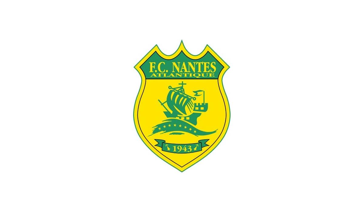
The logo from 1997 was a combination of several previous designs. It was a smooth and sleek crest with a yellow background, where the green clipper on the green wave with eight yellow stars was placed. Under the image, the green ribbon with “1943” was located.
The wordmark “F. C. Nantes Atlantique” was written in a classy and bold serif typeface in yellow, on the top green part of the crest.
2003 — 2008

The crest was modernized and cleaned in 2003. The ribbon with the club’s year of foundation was removed, and the ship itself became more minimalist.
The stars were replaced from the wave to a white stripe above the clipper image and separated the graphical part of the logo from the wordmark, which now featured a strong and bold sans-serif font.
2008 — 2013
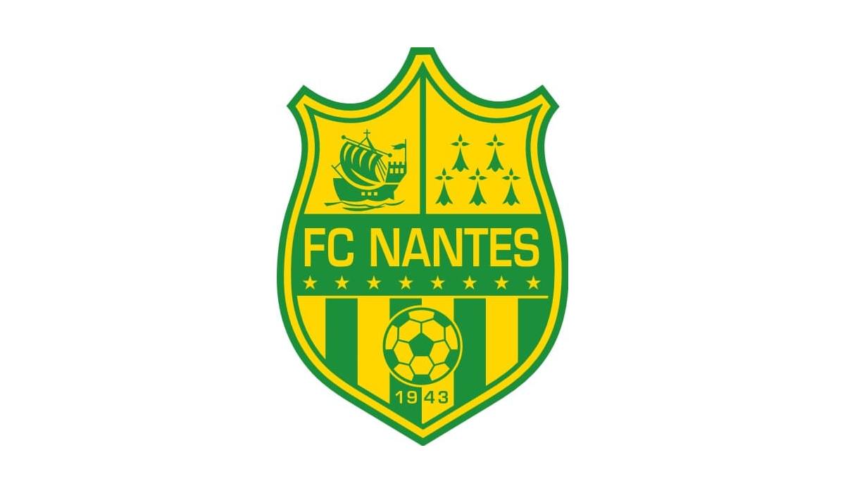
In 2008 the club redesigns its crest again. Now it is divided into four parts — with the wide horizontal green line of the “FC Nantes” wordmark in the middle.
The biggest part of the composition was placed on the bottom of the crest and featured a vertical stripes pattern with a green and yellow football and “1943” inscription under it.
The top part with the yellow background was vertically divided into two equal segments, with the clipper drawn on the left one, and five club’s symbols — on the right.
2013 — 2014
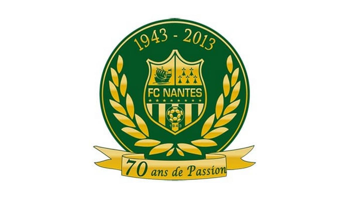
To celebrate the club’s 70-years anniversary, the new emblem was introduced in 2013. The crest from the previous version was redrawn in gold and green and placed inside a solid green circle with a gold laurel wreath at the bottom. The “1943 — 2013” inscription was placed on the top part of the emblem, along the circular perimeter, and the gold ribbon with the “70 ans de Passion” lettering was placed under the emblem.
2014 — 2019

In 2014 the club brings back the crest from 2008, keeping everything as it was, without any changes.
2019 — Today
![]()
The visual identity design from 1019 is completely different from all the previous versions. The is no more clipper image on it.
The new logo is composed of a white or green shield with an enlarged stylized letter “N” on it, and a yellow club’s heraldic symbol on the bottom. The “FC Nantes” inscription is placed above the shield and executed in a strict and clean sans-serif typeface.


