Chelsea is One of the most famous British football clubs, which was established in 1905. One of the most successful representatives of the English Premier League, The club was acquired by Roman Abramovich in 2003. The head coach of the football team is Frank Lampard, a sports legend, there is also a number of the world’s most famous football players in the current squad.
Meaning and history
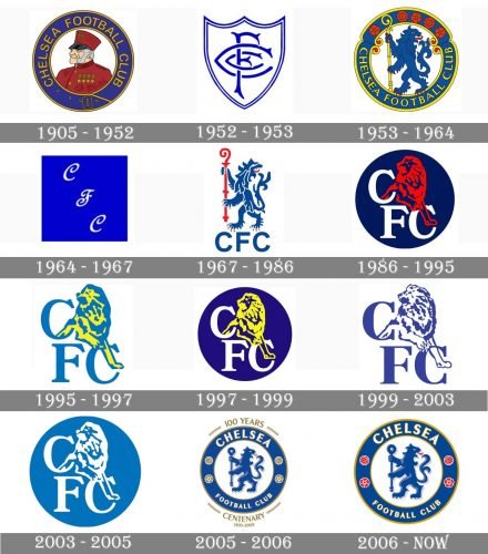
The current visual identity of the famous football club is instantly recognizable across the world, but before getting to the iconic image, the club has changed more than ten different emblems during its long and successful history.
What is Chelsea?
Chelsea is the name of a professional football club from Great Britain, which was established in 1995. Today Chelsea is one of the strongest clubs in the English Premier League, it has Stamford Bridge Stadium as its home ground, and is owned by the BlueCo 22 Limited company since 2022.
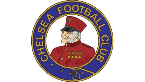
1905 – 1952
The very first logo of the English football team was a portrait of the pensioner, facing left. The image was enclosed in a circular frame, where the “Chelsea Football Club” lettering was placed around the perimeter. The logo was executed in blue and yellow colors, reflecting stability and professionalism. Since the fiat years, blue has become the main color of the club’s palette and the inevitable part of its visual identity. After launching the logo, football team instantly got the nickname “The Pensioners”.
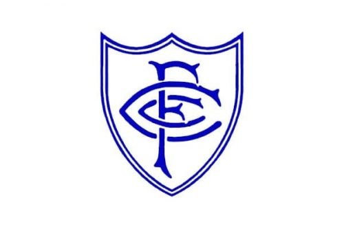
1952 – 1953
The first redesign of the logo was held only in 1952. It was a pretty short experiment with a shield shape, where the club’s initials in blue were written. The logo stayed with Chelsea for only one year and was the only version, using the heraldic shape of the frame.
1953 – 1964
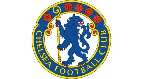
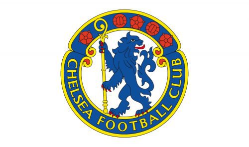
The redesign of 1953 brought the famous lion rampant to the club’s visual identity. The logo, created by Ted Drake, depicted a blue lion holding a yellow staff. The picture was enclosed in a wide blue circle with a yellow outline. The wordmark was placed around the perimeter of the frame, in its bottom part, and featured yellow color. On the upper part of the frame, there were five red rounded symbols.
1964 – 1967
From 1964 to 1967 the football team was using a simple blue square with three ornate white letters, “CFC”, placed diagonally, from the upper left corner to the bottom right. It was a simple and modest logo, which didn’t stay long, and soon was changed to the lion again.
1967 – 1986
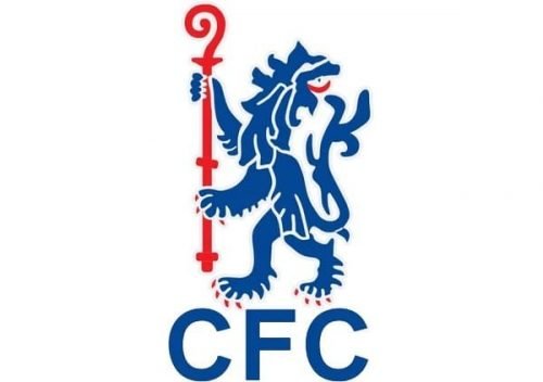
The white lion rampant with the red staff was placed on a blue background and had a white “CFC” inscription under it. That was the logo design, created in 1967. A few years later, in 1970, an FA Cup was added to the left of the lion, and in 1971 — two white stars, to celebrate the wins of the football club.
1986 – 1995
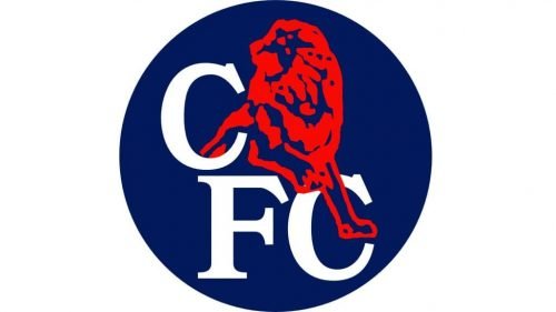
In 1986 the logo was redesigned again. A completely new style was brought to the club’s visual identity by Le Coq Sportif, who were the official uniform suppliers of the team. The red lion was placed over the “FC” lettering, coming out of another “C”, placed above them. The image was put inside a navy-blue circle.
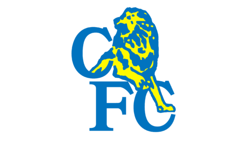
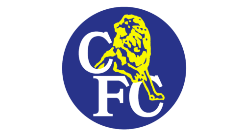
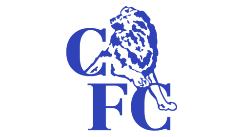
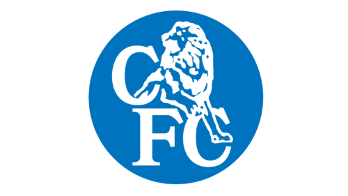
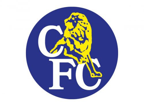
It stayed with the football team for almost twenty years and changed its color palette four times. In 1995, it was a yellow and blue lion and blue lettering, which was replaced by a yellow lion, white inscription and bright blue background in 1997. Starting in 1999, there were only experiments with the blue color palette — a navy blue image on a light sky blue background from 1999 was changed to a white symbol inside a calm blue circle.
1995 – 1997
The Chelsea badge, refined in 1995, featured a blue and yellow lion with the monogram, placed against a plain white background, with no rounded or frames. All elements have kept their style and contours, but in the new color scheme the composition started looking more progressive and bright.
1997 – 1999
The redesign of 1997 has brought back the roundel, but this tile it was a deep and very bright blue, while the Lion became acid-yellow, and the lettering turned white. This design stayed with the football club for a couple of years.
1999 – 2003
In 1999 the Lion and the monogram turned blue and were placed on a simple white background, with the roundel removed from the composition again. This logo looked very calm and professional, showing the football club as a confident and strong one.
2003 – 2005
The redesign of 2003 has introduced the last version of the Chelsea badge with the Lion and the monogram. The emblem was drawn in white and placed on a solid blue roundel, with a smooth and calming shade of blue, which looked very stable and exquisite.
2005 – 2006
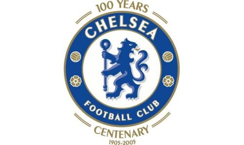
To celebrate the 100th anniversary, the club brings back the lion rampant, refining its contours and adding some volume. The background is now light blue, and the framing features the same deep shade and the lion, while the outline and the lettering feature gold details. For only one year the logo was in use, and the gold letters “100 Years Centenary” were placed under and above the rounded emblem.
2006 – Today
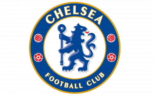
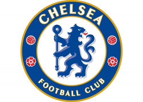
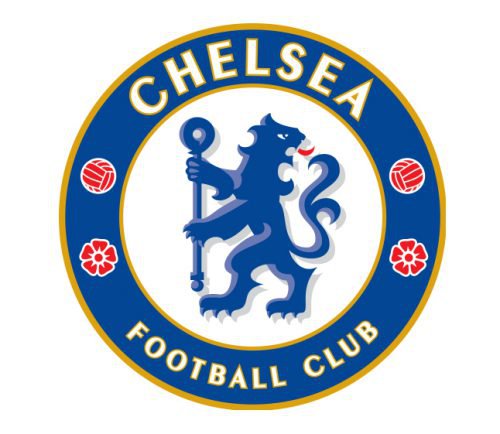
In 2006 the anniversary lettering was removed and the logo gained some red details, symbolizing passion and power. The staff is now colored blue, as the lion and the frame, while the lion’s tongue is red and the inscription is executed in white and yellow.
The wordmark in all capitals is executed in a bold and elegant sans-serif typeface, which is pretty close to Chong Old Style Pro font, with delicate yet stylish and confident lines, evoking a sense of expertise and authority.
Symbol
Today’s Chelsea logo is similar to the one that was in use from 1953 until 1986 but for a number of slight changes. The lion rampant regardant bears a staff of the Abbots of Westminster
Emblem
The current Chelsea logo emblem was introduced in 2005, and it was well accepted by Chelsea fans and the team itself.
Shape
The Chelsea logo features the lion rampant regardant in a blue circle, which is outlined with gold on the inside and outside. The circle bears the club’s name, two balls and two roses, which are England’s national symbols.
Colors
The Chelsea logo includes blue, white, yellow, and red colors – a combination, which expresses energy, elegance, excellence, and perseverance.
Font
The club’s name is written in a sans-serif typerface.
Chelsea Colors
BLUE
PANTONE: PMS 7687 C
HEX COLOR: #034694;
RGB: (3, 70, 148)
CMYK: (100, 83, 10, 1)
RED
PANTONE: PMS 1788 C
HEX COLOR: #EE242C;
RGB: (238, 36, 44)
CMYK: (0, 98, 91, 0)
GOLD
PANTONE: PMS 7555 C
HEX COLOR: #DBA111;
RGB: (219, 161, 17)
CMYK: (15, 37, 100, 1)
LIGHT BLUE
PANTONE: PMS 2115 C
HEX COLOR: #6A7AB5;
RGB: (106, 122, 181)
CMYK: (64, 51, 4, 0)
GRAY
PANTONE: PMS 427 C
HEX COLOR: #D1D3D4;
RGB: (209, 211, 212)
CMYK: (17, 12, 12, 0)


