Arm & Hammer is an American brand of personal hygiene products and household goods. The company was established in 1846 and today it is known all over the globe, with its soda-based deodorant as the most popular product.
Meaning and history
Arm & Hammer is a personal hygiene brand from the United States, which has been one of the most popular labels in its country since the date of its establishment, in 1846. The brand was founded by Church & Dwight, an American manufacturer of household products. Along with Arm & Hammer the company owns several more labels in this segment.
Arm & Hammer created a whole series of household chemicals. The brand now produces detergents, dishwashers, floor cleaners, toothpaste, deodorants, and capsules for swimming pool cleaning. The main ingredient in all the products is sodium bicarbonate, i.e. ordinary baking soda.
The Arm & Hammer brand cares not only about the health of consumers but also about the future of the planet. Since the 1880s the company has been carrying out actions to protect nature. In 1907, Arm & Hammer was among the first to recycle product packaging to reduce waste.
The brand also pays special attention to the composition of household chemicals. The main rule of the company is that products must decompose quickly and be harmless to the environment. In addition, Arm & Hammer supports two major charities: Arbor Day Foundation and Green-e. The organizations are engaged in the greening of the planet and the search for environmentally safe sources of energy.
What is Arm & Hammer?
Arm & Hammer is the name of a personal hygiene products brand, which was established in the United States in 1846, and by today has grown into one of the leading companies of its segment in America, with the products, especially deodorants, distributed in various countries too.
1846 – 1969
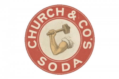
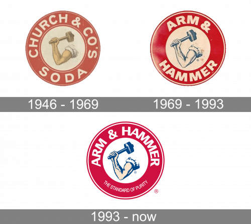
The original emblem used a beige circle with a red frame around it. The former held an image of an arm with a mallet in it. The latter had ‘CHURCH & CO’S’ written in big white letters throughout the ring.
1969 – 1993
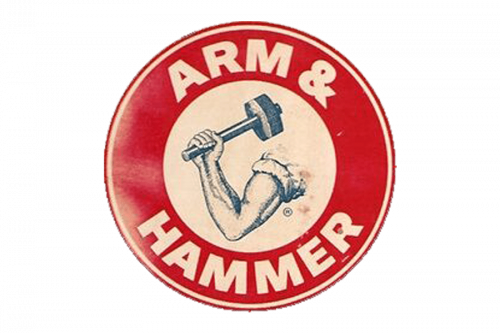
In 1959, they edited the text to ‘ARMS & HAMMER’, which used the same font, but with bolder letters. The arm-hammer combination in the middle was left as it was, but given a darker color scheme.
1993 – Today
The visual identity of Arm & Hammer is very masculine and memorable. The circular emblem with an image in the middle and a wordmark around the perimeter is instantly recognizable and truly unique.
The emblem is composed of a bold red circle with a smaller white one in the middle. The man’s arm with the hammer in it is placed inside the white circle, while the white “Arm & Hammer” lettering in all capitals is located on a red background, in the upper part of the circle.
There is also an additional “The Standard of Purity” inscription in smaller and thinner letters located on the bottom of the red thick frame.
The wordmark of the brand’s emblem is executed in a strong and straight sans-serif typeface with solid ad balanced letters, which evoke a sense of power and stability.
The bright insignia of the American brand is a representation of masculinity and a fundamental approach to personal hygiene without any “fancy” stuff. It looks pro-fessional and simple, just what most men in the world need.
Font and Color
The bold and masculine uppercase lettering from the primary Arm & Hammer logo is set in a clean and stable sans-serif typeface, which looks very clean and graphical. The closest fonts to the one, used in this insignia, are, probably, Pierce Jameson Sans Bold, or Linear Ultra Bold Extra Wide, with some minor modifications of the letters.
As for the color palette of the Arm & Hammer visual identity, it is based on a deep and calm shade of red, with an addition of blue, white, and nude-beige, making up a scheme, which stands for strength, growth, development, and stability.


