The logo of the American company Allison Transmission looks memorable and modern. On the downside, it bears an uncanny resemblance to the old Pepsi logo.
Meaning and history
Allison Transmission is a world leader in the design, manufacture, and sales of automatic transmissions for medium- and heavy-duty trucks, buses, and off-road vehicles, as well as oil and gas equipment, municipal, airfield, and quarry special equipment.
Allison was founded in 1915 in Indianapolis, Indiana, USA, where its international headquarters are located today. The company’s network of partners includes about 1,4 thousand dealers and distributors, the number of employees exceeds 2,5 thousand, and the company’s products are sold in more than 100 countries around the world. Allison Transmission manufactures equipment for more than 300 of the world’s leading automakers.
All Allison transmissions are reliable, efficient, easy to use, and meet the specific requirements of any equipment, whatever the application. More than 80% of the world’s commercial automatic transmissions are Allison transmissions, as manufacturers, equipment owners, and drivers trust Allison more than any other supplier.
What is Allison Transmission?
Allison Transmission is the name of an American company, which was established in 1915 by James A. Allison, and is specialized in the production of automatic transmissions and hybrid propulsion systems. Today the company works with more than 200 automaking companies from all over the globe.
1930 – 1950s
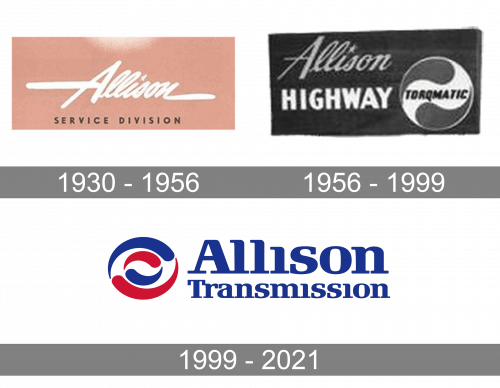
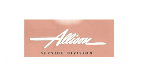
Since 1915, when the company was founded, its emblem has gone through multiple updates. For instance, the ads of the 1930-1950s showcase a wordmark inspired by handwriting. There was more than one “handwritten” version sharing the “A” with an elongated middle bar.
1956 – 1999
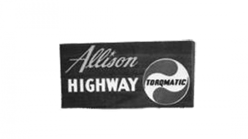
In a 1956 photo from the company archives, you can see the prototype of the current roundel Allison Transmission logo. Here, next to the handwritten wordmark, there is a circle formed by two drops with the word “Torqmatic” in between.
1999 – 2021
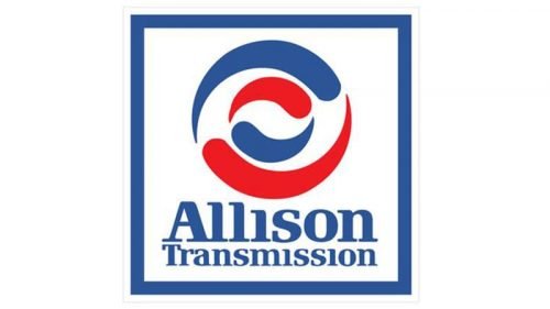
The pictorial part of the Allison Transmission logo consists of a roundel emblem in blue and red on the white background. There are two circles (larger and smaller) placed one inside the other. Each of the circles is formed by two shapes looking very much like curved drops. The two roundels were inspired by the shape of the brand’s core product, the transmission.
If you compare the design with the logo of the popular soft drink Pepsi (especially the versions used in 1950-2008), you will have to acknowledge they look too similar. The circle and the drop shape would already have been enough. The palette, which is almost the same, makes the resemblance even worse. The current Pepsi logo is somewhat less similar to Allison’s emblem, though.
Also, the design forces behind the brand opted for a creative type, which added the logo a unique touch. Some of the most distinctive features of the wordmark are the unusual serifs on some of the letters as well as the lack of the dots above the “i’s.”
Font and Color
The smooth and bold serif lettering from the primary badge of Allison Transmission is executed in a heavy yet elegant serif typeface with softened contours and massive visible serif on the wind of the bars. The closest fonts to the one, used in this insignia, are, probably, Republic Std Bold, or Prima Serif Std Bold, but with the contours softener and modified.
As for the color palette of the Allison Transmission visual identity, it is based on dark and intense shades of blue and red, set on a clean white background. This scheme stands for confidence and experience, with a powerful and reliable character of the company, and its professionalism.


