ArcelorMittal is one of the world’s biggest steel and mining corporations, which was founded in 2006 in Luxembourg after the joining of two big brands, Arcelor and Mittal.
What is the symbol of ArcelorMittal?
The symbol of ArcelorMittal is a bold abstract figure, drawn in a softened orange line above the logotype of the company. This element, designed by a British bureau Future Brand, is a stylized representation of two letters, “A” and “M”, standing for the two companies, which merged into ArcelorMittal at the beginning of the 2000s.
Meaning and history
ArcelorMittal is a rapidly growing company, which top priorities are safety and improvement. The brand was formed through a merger of a young Luxembourg-based Arcelor, which was founded in 2002 and became Europe’s largest steel manufacturer, and the huge Indian Mittal company started operating in 1976.
The ArcelorMittal visual identity is based on simplicity and elegance. It is composed of a wordmark with an abstract graphical symbol above it.
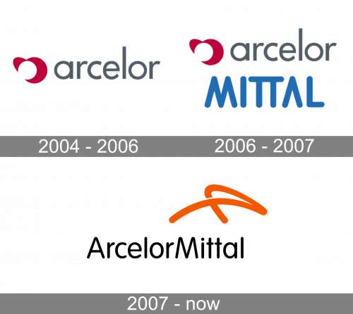
2004 – 2006
The original logo consisted of a grey wordmark that used lowercase sans-serif letters and an emblem. The latter resembles a bloated red heart with a chunk missing from the center.
2006 – 2007
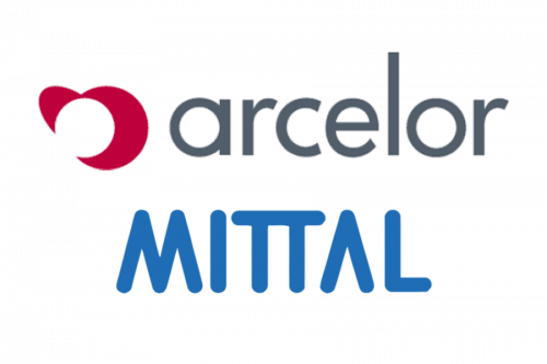
In 2006, they added the word ‘Mittal’ to beneath the logo. This one was written using capital blue letters. The font was a sort of soft, round sans-serif.
2007 – Today
The wordmark, consisting of the two companies’ names, is executed in an elegant sans-serif font, which is similar to VAG Rounded Light, designed in 1991 by Alan Meeks. It has fine straight lines with rounded angles, that evoke a sense of a high-quality approach to everything ArcelorMittal does.
The simple and modest gray lettering is balanced by a bright symbol, which represents an abstract image of the first letters of two companies, Arcelor and Mittal.
The emblem’s orange color is a symbol of energy, creativity, and positive thinking. The ArcelorMittal minimalist logo is a great reflection of companies’ values, power, and trustworthiness.
Font
The type featured in the ArcelorMittal logo looks very much like VAG Rounded Light, which was developed by Alan Meeks in 1991.


