Rite Aid Corporation is a drugstore chain, the third largest one in the U.S. It is headquartered in Camp Hill, Pennsylvania, US. It ranked No. 94 in the 2018 Fortune 500 list of the biggest American companies by total revenue.
Meaning and history
The Rite Aid logo has always featured the shield as one of its core elements. It doesn’t mean the design has remained completely the same, though.
1962 – 1963
Alex Grass opened his first store in the fall of 1962. The store was named Thrif D Discount Center. By 1966, there were already stores in five more states.
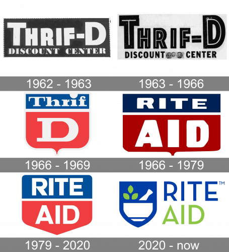
The original logo already showcased the shield that has been used in every version ever since. The shield was divided into two fields and housed the original name of the store chain. In the top field, there was the word “Thrif,” while the letter “D” could be seen below (both in a serif type). To the right, there was the lettering “Discount Center” in an all-caps sans serif type. It was bolder, larger, and better legible than the writing “Thrif D.” This was because initially, the customers weren’t familiar with the brand, so the word “discount” was more important to attract their attention.
Below, you could see the text “Health & Beauty Aids,” which was also an essential explanation for the people who walked by the store.
1963 – 1966

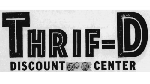
In 1963, they reversed the colors by painting all the letters black and putting them onto the white/grey background. Besides that, they changed the font of the lower text to a serif style. The upper text didn’t change, although they did add white lines in the letters’ cores for some reason.
1966 – 1969

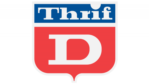
By 1966, they opted for a red-&-blue color palette they kept on using until 2020. That’s also the first instance of their iconic shield emblem. This one has the word ‘Thrif’ in the blue part above, and the big letter ‘D’ in the middle of a red portion.
1966 – 1979
The chain went public under the name of Rite Aid. The logo was updated respectively. The shield preserved its shape almost unchanged. Again, there were two fields, a darker one (dark blue), and a lighter one (saturated red).
The top field, which was smaller, housed the word “Rite.” The lower field, in which the word “Aid” could be seen, was larger. The letters were also bolder, larger, and, as a result, better visible.
1979 – 2020
The proportions grew different – the shield now seemed higher, more like a typical shield. The top angles were rounded, while the lower part adopted the triangular shape.
The proportions of the two fields appeared to be based on the golden ratio. As for the two words, they now had the same height and didn’t overshadow one another. It was different from the previous Rite Aid logo where the word “Aid” caught your eye, while “Rite” was lost.
The colors grew lighter and brighter.
In the 1990s, the company used a secondary logo of a pretty different design. You could see the words “Ride Aid” in red over the white background. Below, there was the white word “Pharmacy” inside an elongated red rectangle with rounded corners.
2020 – Today
The design went through a complete overhaul.
While the shield was preserved, it now housed an image symbolizing the products sold in the store. There was a mortar and a pestle, like pharmacists (and alchemists) of old times used. Also, you could see green leaves. Both the leaves and the mortar conveyed the message of “natural remedies.”
To the right of the shield, there was the name of the brand set in a minimalist sans. The letters were lighter than in the previous version, although they were still legible enough.
The first word featured the same shade of grayish dark blue as on the shield. The word “Aid” below was colored green, like the leaves on the emblem.
Font
The original 1960s logo was the only one that included a serif type. Even there, it was paired with the lettering in a sans serif type, which occupied the majority of the space.
Later, the company switched to simpler and better legible sans serif typefaces.
Colors
Blue has always been present on the Rite Aid logo. There was some experimenting with the hue. The previous versions also included red but it was eventually replaced by green, to leave the impression of natural products.


