Altria is the name of the tobacco company, which was established in 1985 in the USA under the Philip Morris name. Being one of the most famous cigarette manufacturers in the world, Altria also produces wine and e-cigarettes.
Meaning and history
Altria Group, Inc. was earlier known as Philip Morris Companies. Its roots can be traced back to 1835 when Philip Morris was born. Today, the Group is known among the largest producers and marketers of tobacco, cigarettes, and related products in the world. The corporation is headquartered in Henrico County, Virginia, US.
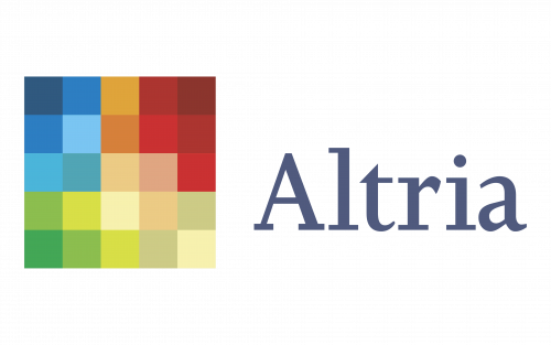
The name “Altria” was adopted in 2002, while the logo was introduced within a year. It features a grid of color squares. There are 25 squares colored in various shades of blue, green, orange, beige, brown, and red. Some of the shades are featured in a single square, while others are used for two squares.
According to the company’s press release, the emblem was inspired by the best-known brands it owned, including Kraft Foods and different branches of Philip Morris. The new visual brand identity was developed by Landor Associates. As Landor’s executive creative director Richard Brandt explained, the source of inspiration behind the logo was Altria’s “products displayed on shelves at their headquarters.”
What is Altria?
Altria is one of the world’s largest manufacturers and marketers of tobacco, cigarettes, and related products. Formerly known as Philip Morris Companies, the company was established in the middle of the 19th century, and by today has grown into one of the Fortune 1000 businesses.
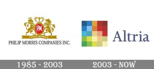
1985 – 2003
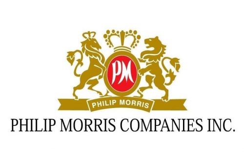
The logo, used by the Altria company until 2003 was based on the Phillip Morris visual identity, with its badge decorated with gold vignettes. It was a vertically oriented red oval with the white “PM” monogram on it, enclosed into a thick golden frame and set between a heraldic horse and a lion rampant. The oval was decorated by a massive golden crown on top and placed on a horizontally stretched ribbon with the name of the company written on it in white capitals.
2003 – Today
The previous emblem (the one representing Philip Morris) was based on the heraldic crown and unicorns used as symbols of British tradition and class.
The redesign of 2003 has created a modern and clean logo for Altria, with the geometric emblem, followed by a modest yet elegant title case inscription. The emblem of the company is a large square, formed by twenty-five smaller squares, which make up a pixel pattern in different colors from yellow to red. As for the lettering, it is written in a bold serif typeface and has its characters colored in a calm shade of blue, which evokes a sense of stability and trustworthiness.
What is the purpose of the logo?
Some experts interrogated by the New York Times in 2003 criticized the Altria logo for being too vague (Ric Grefé, executive director of the American Institute of Graphic Arts, and Randall Rothenberg, director of intellectual capital at Booz Allen Hamilton). In their view, the logo did not represent anything more than the diversity of Altria’s products and the seamless relationship between them.
On the other hand, Michael Bierut from Pentagram said the vagueness of the design was appropriate. He noted that a “purely abstract mark” was a good fit for a company “with an intentionally vague mission.”
Font and color
The elegant title case lettering from the primary badge of Altria is set in a bold and stylish serif typeface with smooth lines and massive serifs. The closest fonts to the one, used for this insignia are, probably, Joanna Nova Book and Jessica Serial Medium.
As for the color palette of Altria’s visual identity, it is based on a combination of different shades of yellow, blue, green, and red, which reflects the variety of products, manufactured by the company. The colorful emblem is balanced by a calm grayish blue hue of the lettering, which adds professionalism and a sense of reliability to the badge.


