Alice in Chains (also known as AIC) is a US rock band based in Seattle, Washington. It was started in 1987 by Jerry Cantrell and Sean Kinney.
Meaning and history
Each version the Alice in Chains logo perfectly embodies the wild style of the music they play, its free spirit, and mystic nature.
“Writing on the wall” wordmark
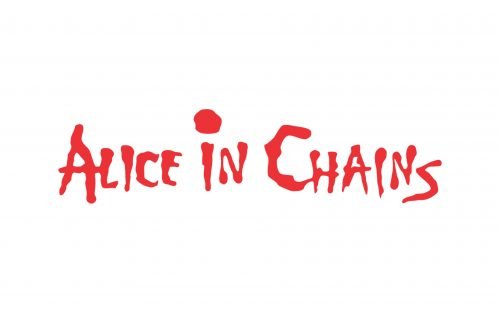
This is probably the best-known visual interpretation of the band’s name. Here, we can see the lettering “Alice in Chains” set in a highly casual (or is “wild” a better word?) manner. The glyphs look as if they had been literally written on the wall by hand. Even the line is not straight – the writing is directed slightly upward. The angle varies a little from one version to another, though.
While the basic version of this wordmark is red on the white background (to allude to the color of the blood), you can also come across various other color schemes. The palette depends on the visual context. For instance, on the cover of the Facelift album (1990), the lettering is white, to create enough contrast with the pretty cluttered background. The wordmark on the cover of the second album, Dirt (1992), showcases an orange and black gradient.
1990
1990 – Today
“Wave” wordmark
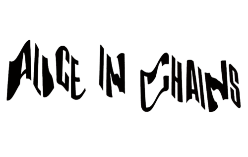
Here, each of the letters in the name of the band is positioned at a different height, which creates an illusion of a wave (or that you see the writing through the water).
We should add that in the “Writing on the wall” logo, there is also a slight “wave” effect, although it is not as prominent.
On the covers of some albums (for instance, Alice in Chains (1995), also known as the Dog Album), the band’s name features a more generic type.
Sun logo
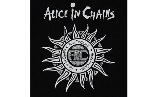
Unlike the logos described above, this is not just the wordmark but a detailed image with plenty of additional symbols.
It was designed by the band’s former frontman, Layne Thomas Staley (1967-2002), for the inlay of the Dirt in 1992.
The centerpiece of the Alice in Chains logo is a circle with plenty of rays symbolizing the sun. In the middle, you can see the letters “AIC” (the abbreviated name of the band). The letters are green with black nuances, which creates a mystic effect, like a window to the other world.
The abbreviation is encircled by the full name of the band, which is repeated three times. Each of the three phrases is separated from its neighbor by a yellow dot. The shape of the letters is the same as on the main wordmark described above. The glyphs are purple.
The background is orange, yellow, and black. It is reminiscent of a fire in the night. There are also plenty of details alluding to pagan imagery, tribal patterns, etc.


