

![]() Airtable Logo PNG
Airtable Logo PNG
Airtable is the name of a California-based company, which was established in 2012, and is specialized in the services for managing databased and cloud solutions.
Airtable is a cloud service for working with spreadsheets and databases. It allows you to link tables to each other or third-party services, and to build applications based on them without code.
Meaning and history
![]()
Airtable is a popular zero-code tool that is used by all kinds of professionals, from photographers to managers. The service has many features that make it useful for every programmer.
With the service, anyone can create databases for all occasions. The user-friendly interface, easy interaction of tables, sorting and grouping of data, easy search, and the ability to create views in the form of calendars, Kanban cards, and forms – all make Airtable an indispensable tool in work and everyday life.
Airtable has a powerful feature – views. You can create multiple views for tables in Airtable, showing the data from the table in the form you need. The views allow you to hide unnecessary fields, sort rows, highlight rows by attribute, filter rows by value, or group rows. We may need the same table data for different things: to find new customers, to find out the profitable type of customer, to group customers by the manager — views allow you to easily create such slices and focus on what you need.
Airtable is a service that allows you to create databases for all occasions. Its simple and pleasant interface makes it intuitive for any user.
What is Airtable?
Airtable is an intelligent organization and collaboration tool that offers any team of any size a single and centralized platform for managing projects, clients and ideas. Allows users to organize everything with anyone and from anywhere. The tool was introduced in 2013.
In terms of visual identity, the software designed in San Francisco hasn’t changed its logo much since the day it was first introduced. The early version had just a bit less air between the elements of the emblem, and the typeface of its lettering looked a little simpler, but the structure, color palette, and idea remained the same.
2012 – 2016
![]()
The logo represents Airtable, a cloud collaboration service. It’s characterized by a stylized, three-dimensional geometric figure that resembles a floating cube with a corner facing forward, composed of three distinct colors: a gradient of blue, teal, and a flat purple, meeting a solid, flat yellow. These colors are vibrant and modern, giving the logo a dynamic and innovative feel. Adjacent to the icon is the word “Airtable,” written in a clean, sans-serif typeface. The black color of the text provides a stark contrast to the colorful icon, ensuring the brand name is legible and anchoring the logo with a sense of sophistication and simplicity. The lowercase “a” in “Airtable” has a playful twist with a rounded design that mirrors the soft edges of the icon, suggesting approachability and user-friendliness. This logo is an embodiment of the brand’s essence, which is all about enabling collaborative work and structured flexibility through its platform.
2016 – Today
![]()
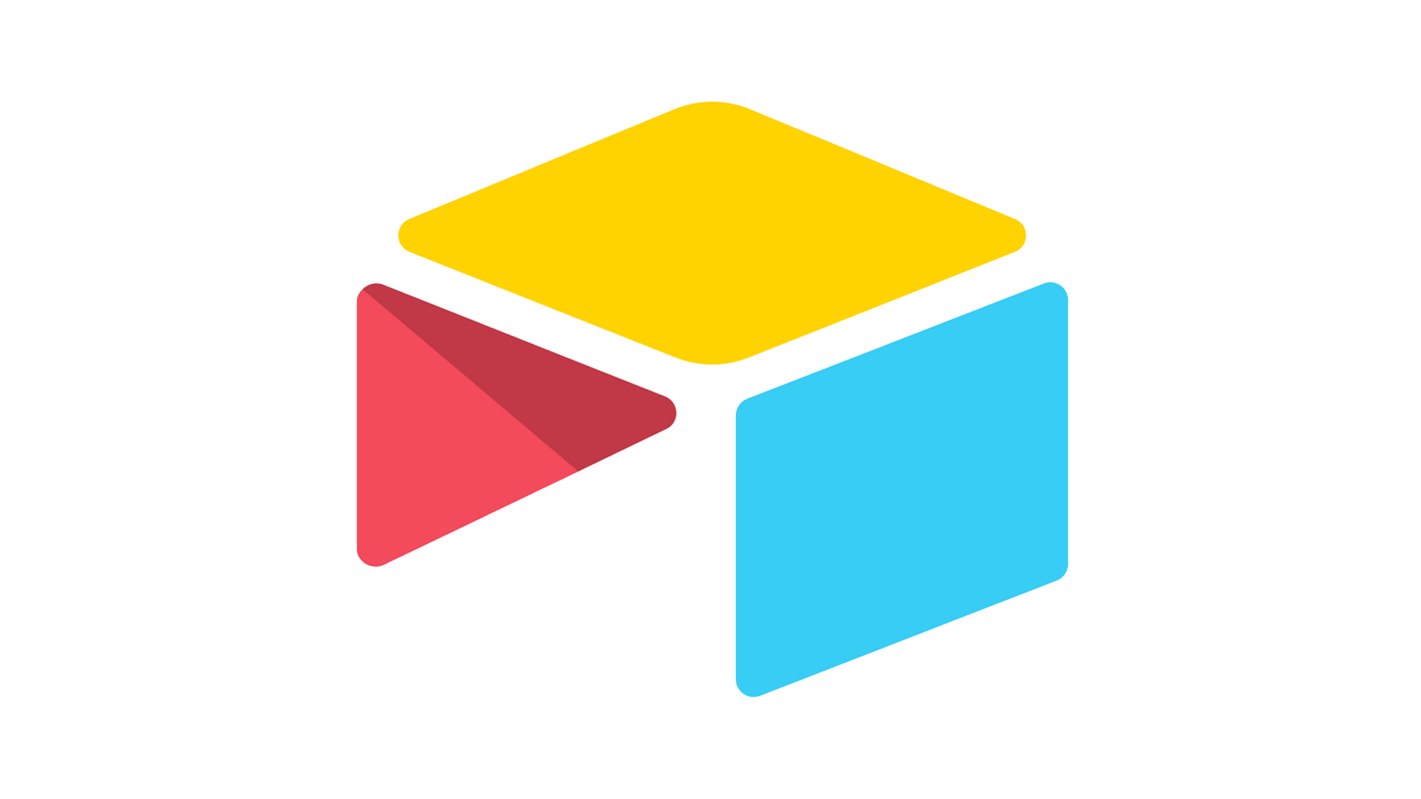
The Airtable logo is composed of a graphical emblem in three colors, followed by a laconic and quite traditional wordmark in a title case. The emblem depicts a stylized table, formed by three geometric figures — two parallelograms and one triangle. The table is placed in 3/4 and has each of the elements executed in its color. Thus, the top parallelogram is set in yellow, the side one — in bright turquoise, and the triangular is red with some pink hues and a slight shadow on its upper part.
As for the lettering part of the Airtable logo, it looks very modest and simple, using a bold regular sans-serif typeface for its title case inscription, set in dark gray. The color of the wordmark balances the brightness of the emblem, adding a touch of professionalism and confidence to the whole composition.
Font and color
The stable and bold Airtable lettering from the company’s official logo is set in a traditional sans-serif typeface, which looks pretty similar to such fonts as Reaktif Bold, and Lto. Poligon Poligon Bold and XXII Geom Bold. Although the lines and shapes of the letters here are pretty usual for many types, the font is just regular and has zero unique elements.
The color palette of the Airtable visual identity is much more interesting than its typeface. The badge uses bright shades of yellow, turquoise, and red to balance the gray boredom of the inscription. These colors make the logo look energetic and delightful, evoking a sense of progressiveness and creativity.


