

![]() Air Force Falcons Logo PNG
Air Force Falcons Logo PNG
While the old primary logos of the athletic teams representing the United States Air Force Academy featured falcons, the current one includes only two letters.
Meaning and history
![]()
To better understand the evolution of the university’s brand identity, we should probably start the story from the earliest Air Force Falcons logo and compare it to the current one.
1954 – 1962
![]()
The emblem unveiled in 1954 featured a falcon with its wings spread wide. The creature had a gray lightning shape in its paws. On the background, there was a pale bluish roundel encircled with the name of the academy.
1963 – 1994
![]()
In 1963, the logo was redrawn from scratch. There was now a completely different falcon, although it also had its wings spread and was holding a bolt of lightning in its claws. The bird was drawn in blue and white.
1995 – 2003
![]()
The 1995 emblem added yellow, gray, and black details. The falcon now seemed to be moving faster, and a totally new wordmark was introduced.
2004 – 2018
![]()
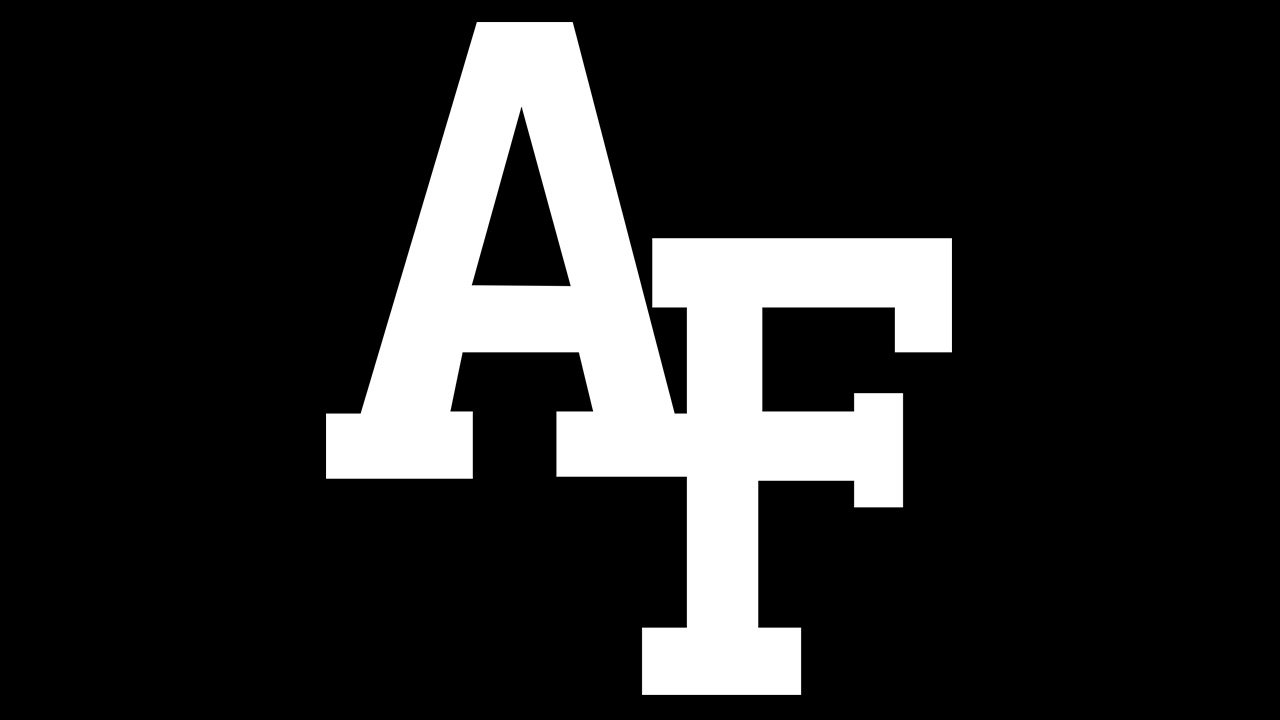
Eventually, in 2004, the Air Force Falcons logo was reduced to just to letters, “A” and “F.”
2018 – Today
![]()
Air Force Falcons football
The team started competing in 1955. It has belonged to the Mountain West Conference since its founding in 1999. The 1985 season has been considered the team’s most successful one so far.
Air Force Falcons Colors
BLUE
PANTONE: PMS 287 C
HEX COLOR: #003087;
RGB: (0,48,135)
CMYK: (100,75,2,18)
SILVER
PANTONE: PMS 877 C
HEX COLOR: #8A8D8F;
RGB: (138,141,143)
CMYK: (45,34,34,0)


