Mestis Finland is the name of a professional hockey league from Finland, which was established in 2000. Today it is the second-tier league in its country in ice-hockey and consists of 15 professional clubs from all over Finland.
Meaning and history

Mestis Finland was established in 2000 as the successor of the I-Divisiona, the most reputable ice-hockey league in Finland at that time. Today Mestis is the second-tier league, which gives a road to young teams to the Liiga, the top organization of Finnish hockey.
Mestis is the middle stair between the Suomi-Sarja league, where the youngest professional ice-hockey clubs start their career, and the Liiga, which gives the strongest players in the world.
What is Mestis Finland?
Mestis Finland is the second highest professional hockey league in Finland, which was founded in 2000, and today is composed of 15 ice-hockey clubs, which compete for the league’s title annually.
2000 — 2015
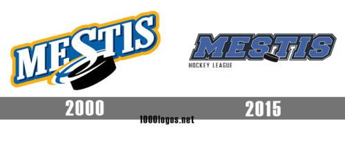
 As for the old emblem, it also comprised the lettering “Mestis” (this time in white) and a puck. And yet, the hockey puck was larger here, so it didn’t look out of place.
2015 — Today
The 2015 Mestis logo was adopted in 2015. Its main element is the large lettering “MESTIS” in bold italicized letters. The glyphs themselves are dark blue, while their outline is black. There’s a stylized black puck between the letters “S” and “T.” The puck looks a bit too small in comparison with the wordmark and because of this, you may easily overlook it.
Font and Color
The heavy geometric uppercase lettering from the primary badge of Mestis Finland is set in a square serif font with slanted characters, which makes the brutal and powerful combination a bit more energetic and adds a sense of motion to it. This kind of font is often used by universities and colleges, as it evokes a sense of progressiveness and determination.
As for the color palette of the Mestis Finland visual identity, it is based on a powerful and intense combination of calm blue and black, with some thin white elements, creating a contrast between the elements of the lettering. This color scheme looks strong and stable, representing power, professionalism, and loyalty.


