The logo of the teen apparel retailer Aéropostale, Inc. has been modified only once. This move coincided with the change of ownership.
Meaning and history
Aeropostale is an American casual clothing and accessories manufacturer, focused mainly on young garments for the young audience. The company openedits first stores back in 1987 in California and New Jersey, and today has locations not only in the United States but worldwide.
Aéropostale takes its name from the French mail carrier, the legendary Aeropostale from the 1920s, whose pilots included Antoine de Saint-Exupéry, who later glorified the feat of aviators in his novels Night Flight and The Southern Mail.
The accessories and clothes made by Aeropostale are very individual and have positive youthful energy, a special charm of carelessness, and joie de vivre. The brand is famous for its casual style models for young customers, but everyone, regardless of age, can find something suitable for themselves among the label’s products, distinguished by practicality and convenience.
Today the quality of the brand’s products is comparable with the quality of airplane parts, the speed of appearance of new models by the label is like the swiftness of a flying airliner, and the unbridled imagination of the company’s designers is like the beauty of a plane sparkling in the sky.
What is Aeropostale?
Aeropostale is an American brand of casual clothes and accessories, which was established in 1987, and by today has grown into one of the largest fashion manufacturers in its country. The brand has collections of clothes, accessories, and perfumes for men and women.
1987 – ….
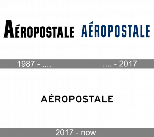
The original Aeropostale logo, designed for the brand in 1987 was based on an extra-bold serif logotype in the uppercase with the first “A” significantly enlarged. The solid black narrowed letters of the inscription were softened by slightly curved bars and sharp thin serifs on their ends. The badge looked very stylish and progressive.
…. – 2017
 The previous version was a little more unique due to the color choice and the typography. The design forces behind the brand opted for navy blue, which made the logo stand out among hundreds of black-and-white logotypes of fashion brands and retailers.
The type was also somewhat unusual, with its elongated glyphs and the distinctive “S.” The curves of the “S” looked as if they were cut or pressed. The “R” and the “O” also seemed to have been pressed from both sides. The approach seemed pretty reasonable for a brand with such a long name. One more memorable detail of the Aeropostale logo was the triangular shape of the accent above the “E.”
2017 – now
 The 2017 logo Aeropostale logo features the name of the brand in black over the white background, which is the most widely used color scheme in the world of fashion. The type is a pretty generic sans with average proportions and spacing. Probably the most distinctive glyph is the “E” with its very short middle bar. Also, the fact that an acute accent can be seen above the first “E” adds a unique touch. If not for these details, the logo would probably have been indistinguishable among its competitors.
Font and color
The clean and modern uppercase logotype from the primary Aeropostale badge is set in a geometric sans-serif typeface with medium-thick lines of the letters. The closest fonts to the one, used in the Aeropostale insignia, are, probably, Saa Series E D and Westmount Light.
As for the color palette of the Aeropostale visual identity, the lettering can be seen both in red and black against a white background. This traditional color scheme makes the badge timeless and elegant, evoking a sense of power and professionalism.


