A&E (previously called the Arts & Entertainment Network ) – American cable and satellite channel. Besides United States it also is broadcast in Canada, Australia, Latin America and Europe.
Meaning and history

The headquarters of the channel is located in New York . Moreover, it also has a very interesting logo. It is just white and blue, there you can see nothing but A&E.
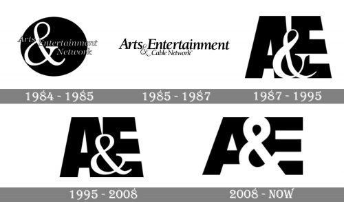
1984 – 1985

The very first logo for Arts Entertainment Network was introduced in 1984 and featured a solid and confident badge with the bold black circle as its main element. Over the circle, there was elegant cursive lettering placed in three levels, and an enlarged white ampersand, set in the left part of the black geometric figure. This version of the logo stayed with the network for less than one year.
1985 – 1987

In 1985 the logo was redesigned in a simpler and more professional style, with the black inscription set in one line on a white background. The “Arts Entertainment” logotype was written in a sophisticated yet bold serif typeface, and the ampersand was set between the words, on the bottom part of the line, drawn in white with a black outline. On the right from the ampersand, there was a “Cable Network” tagline, written in the same font as the main wordmark, but with thinner lines and smaller letters.
1987 – 1995

The redesign of 1987 introduced the emblem, which became a basis for the one we all can see today. It was a stylized massive “AE” monogram in black with an elegant white ampersand placed over the letters, in the middle of the badge. The difference in thicknesses and shapes of the lines made the logo memorable and recognizable, while the monochrome color palette added timelessness and sophistication.
1995 – 2008

The shapes of the symbols were refined in 1995, making the letters more stable and square, and the ampersand — bolder and a bit smaller. The concept and color palette remained untouched, so actually, the redesign didn’t affect the recognizability of the brand at all.
2008 – Today
The redesign of 2008 kept the concept from 1987, but switched the color palette from monochrome to blue and white, and redrawn the contours of the letters and the white ampersand, making them cleaner and stricter. Now the geometry of the badge is brilliantly balanced and the image looks professional and contemporary.


