Adventure Time is the name of the American animated series, released by Cartoon Network in 2007. By today there have been almost 300 episodes created, which tell a story of Finn, a boy, and his dog.
Meaning and history
The visual identity of the famous animated series was designed in 2008, after the release of the pilot, which was planned to be shown on the Nickelodeon channel. The show then was paused and only revived in 2010, but the logo was only slightly modified, keeping the original version’s concept.
2008
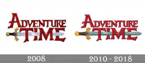
The original logo for Adventure Time was composed of a dark red inscription with one graphical element. The lettering, set in two levels, was executed in all capitals, where the upper, “Adventure”, the part has its “A” enlarged, and the bottom, “Time”, the line had all the letters in one size.
The horizontally located silver sword was coming through the “Time” inscription, creating a middle bar of the “E” with its sharp end. The handle of the sword was executed in brown and gold, with a glossy blue gem in the middle.
The Gothic hand-drawn typeface of the nameplate looked mysterious and unique, and the dark red color with some black accent only elevated this feeling.
2010 – 2018
The logo was redrawn in 2010 when the series was released in Cartoon Network. The lettering was refined and gained more distinct contours and shapes, as well as the dark red color, became a bit lighter and glossier, making the inscription three-dimensional and vivid.
The black accents are now complemented by thin and delicate white ones, while all the letters are outlined in black, in order to make the nameplate more confident and balanced.
As for the sword, it was also redrawn and now it looks more elegant, with thinner lines and a new color palette — light blue for the blade and yellow-gold with chocolate-brown for the handle. The blue gem on it perfectly balanced the blade’s new color and adds harmony and sophistication to the whole logo.
The visual identity of the Adventure Times is bright and memorable. It shows what the series is about and makes people wanna watch it. Though it doesn’t have many details, it looks ornate and colorful, pointing on the quality of the plot and intriguing those who haven’t seen it yet.


