

![]() DreamWorks Logo PNG
DreamWorks Logo PNG
Back in 1994, three well-known people established a film studio called DreamWorks. These people were filmmaker Steven Spielberg, Disney studio chairman Jeffrey Katzenberg, and record producer David Geffen.
Meaning and history
![]()
Originally, Steven Spielberg had the following brief. For one, he wanted the DreamWorks logo to be inspired by Hollywood’s golden age. The logo should have depicted a man on the moon, fishing, and be generated by a computer.
1998 – 2004
![]()
The original DreamWorks logo was composed of just the lettering. The elegant and stable wordmark was set in two levels, with the upper one featuring uppercase characters glued to each other, and the letters “D” and “W” enlarged, and the bottom, “Animation” — in well-spaced characters of the same size. Both levels were written in black and executed in an elegant yet bold and slightly extended serif font.
2004 – 2006
![]()
Dennis Muren, a film special effects artist and supervisor, who worked on many of Spielberg’s films, suggested a slightly different approach. He said the moon-fisher theme would look better if painted by hand.
Artist Robert Hunt, Muren’s friend, was commissioned for the project. He suggested a series of drawings. In addition to those depicting a man, there was also a version depicting a fishing boy. It was this additional version that was eventually chosen by Spielberg.
While the company doesn’t give an official explanation of this choice, we can elaborate on the topic. When a person dreams, she or he in a way becomes more like a child than an adult. Children dream with their horizons unlimited. They don’t know about all these material obstacles that may interfere with their desires. Because of this, nothing is impossible to them.
Interestingly, we even know who the boy had been modeled after – it was Robert Hunt’s son.
The final logo was developed by Industrial Light and Magic based on Hunt’s paintings in close collaboration with Kaleidoscope Films, Dave Carson, and Clint Goldman.
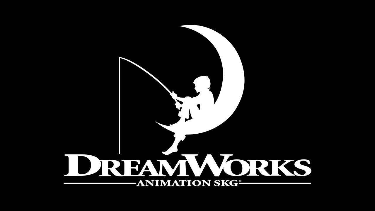
2007 – 2018
![]()
In 2007 the iconic moon fishing logo got its contours cleaned and modernized. Now the image looked truly contemporary and strong. The color palette was also changed and monochrome got replaced by a calm and intense shade of blue, placed on a white background. This new color scheme added a touch of calmness and reliability to the feelings, evoked by the DreamWorks visual identity.
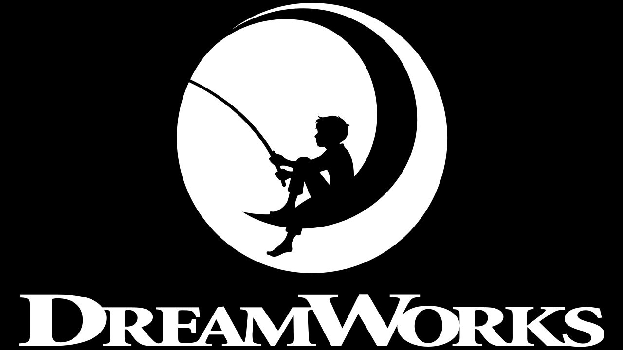
2016 – Today
![]()
The color palette got elevated in 2016. Blue gained a darker shade, which contrasted with white stronger and brighter. As for the graphical part of the company’s logo, it was also changed — now the image of the boy sitting on the moon is drawn in white and placed in a solid blue background, which has a shape of a circle. The logotype remained almost untouched but got all additional tag lines and elements removed; looking cleaner and more modern.
Emblem versions
![]()
Look at the curve of the fishing rod and the boy’s posture. It seems, the boy has caught a fish and is about to take it out. You can also come across a version where the rod is straight and the boy isn’t bending forward, but it’s not the final, approved DreamWorks logo.
Font
![]()
The wordmark appears to feature a customized version of the Minion Pro Black font. The glyphs look very much like this type, with the exception of their vertical and horizontal proportions: apparently, the letters were stretched, so they look by far flatter than the original type.
Colors
DreamWorks and its subdivisions have used several versions of the main logo. While they’ve been pretty consistent in the central image, there was some playing around with the text and, of course, the background (all types of clouds), which means the palette has been updated more than once.
What does the DreamWorks logo mean?
Initially, they wanted to make the logo of the new company using computer graphics. It was supposed to depict a man fishing, but the artists persuaded them to use traditional drawing methods.After the logo was ready, one of the artists created an alternative version. On it, a man fishing on the moon was replaced by a boy. Spielberg liked this version insanely. The boy sitting with a fishing rod on the moon, by the way, was designed by the son of Robert Hunt, the artist who created the logo.
Does Paramount own DreamWorks?
These two companies have never belonged to one team, also the studios have had several collaborations, made throughout the years. DreamWorks is owned by Universal Pictures, while Paramount is a stand-alone corporation.
Is DreamWorks owned by Disney?
While Disney is the brand, owned by The Walt Disney Company, DreamWorks is a completely different organization. This studio is owned by several large companies, including Reliance Entertainment Group, Universal Pictures, Alibaba Pictures, and Entertainment One company.
Does DreamWorks exist?
Yes, DreamWorks Studio, established in the middle of the 1990s, still exists and creates amazing films, which are being loved all over the globe. The only thing changing in the structure of the studio is the name, which first contained “LLC”, then changed to “Studios”, and today turned into “SKG”.


