ACC is an abbreviation standing for the Atlantic Coast Conference, an American sports league, established in 1953. Today the conference has 15 universities as its members, who compete in almost thirty sports (13 men’s and 14 women’s).
Meaning and history
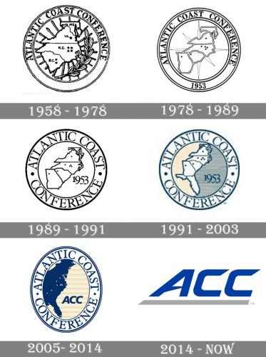
The visual identity history of ACC has been pretty intense and colorful with its logo being redesigned five times since the conference’s foundation in the 1950s. It all started from a traditional rounded badge, which was refined and modified with each rebranding, and came up to a minimalist and modern logotype, which is used by ACC in various surroundings, depending on the sport.
1958 — 1978
The original ACC logo, introduced in the 1950s, featured a circular badge in a double outline, where the wordmark in all capital letters of a traditional sans-serif font was placed. The main part of the badge depicted contours of three states with a leafy branch on its right. It was an elegant and timeless emblem, which stayed with ACC for twenty years and became a basis for further redesigns.
1978 — 1989
The contours of the emblem were refined in 1978. The branch was removed from the badge, making the composition stricter and more geometric. The wordmark got its letter-shapes cleaned and strengthened, while the image in the middle of the emblem was changed, as the fourth state joined the conference. The “1953” datemark was now placed on the bottom part of the framing.
1989 — 1991
The redesign of 1989 enlarged the lettering on the logo, thickening the frame of the circular badge, and putting the datemark in the central part, on the right from the states’ contouring.
1991 — 2003
After the fifth state joined the ACC, the logo was redesigned again in 1991, extending the image in the middle and switching its traditional monochrome color palette to blue, white, and beige, drawing all the contours and letters in blue, and making the background of the middle circle beige in the left and striped blue on the right.
2005 — 2014
The circle became oval in 2005. Now the white states contoured in blue were replaced by a solid blue silhouette, and instead of “1953”, the “ACC” wordmark was placed on the right from it. The lettering on the frame was enlarged and extended, with its serif typeface bold and solid. Two parts of the main inscription were separated one from another by two small solid rhombuses.
2014 — Today

The ACC visual identity we all can see today was introduced by the conference in 2014 and featured a stylish and dynamic logotype in blues underlined with gray. The smooth and sleek contours of the letters are accompanied by the sharp elongated ends of the lines, which add a sense of motion and energy. Depending on the sports, the logotype can be placed inside a blue and white football, or rugby ball, sometimes the emblem gains tagline a, placed around its frame’s perimeter, and executed in blue and gray.
Font and color
The custom ACC logotype is executed in a stylish and futuristic typeface with softened angles and pointed ends, and this combo is perfectly balanced, making the whole logo look professional and progressive. The ACC typeface looks close to such fonts as Recharge Bold Italic and Hyperspace Race Expanded Heavy Italic.
The blue and gray color palette of the ACC visual identity reflects the organization’s purpose and character, showing it as a reliable and confident one, and pointing to its expertise, authority, and experience.


