 Lingerie Football League Logo PNG
Meaning and history

Legends Football League is a women’s American football league. In January 2003, American entrepreneur Mitchell Mortaza was at Super Bowl XXXVII and wondered if most of the fans would still be sitting if girls in underwear played at halftime in American football. During the break of the next Super Bowl, the first-ever Cup of Lingerie was played. Then, they were not held until in 2009 Mitchell organized the Lingerie Football League. In the first season, 10 teams fought for victory, and in recent years the league has appeared in several more countries. Later, LFL was transcribed as Legends of Football Leagues and its matches have full stadiums, teams are coached by former players from the NFL, and matches are also judged by referees from the NFL. The peculiarity of the game is that in addition to the protection, the players have only a bra and underpants. The LFL has some of the most athletic, passionate, and beautiful female athletes in the world. Each team has seven players, the match takes about an hour. In the event of a tie, the game is briefly extended until one of the teams wins.
2008 – ….

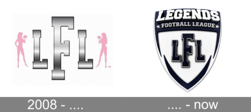
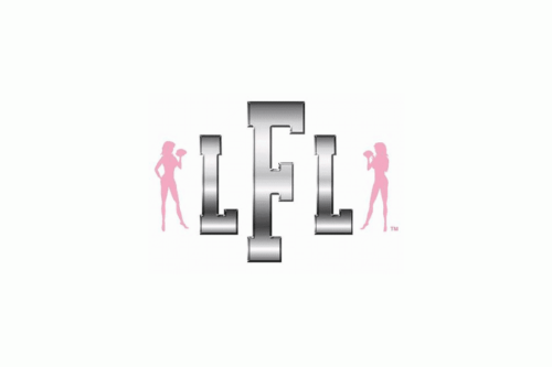
The Lingerie Football League was the original name of the Legends Football League. Although a new logo was adopted in 2013, following the introduction of the new name, it’s interesting to take a quick glance at the old Lingerie Football League logo and appreciate its bold design.
The largest element of the logo is the grey “F.” And yet, it’s not the letter that catches your eye but the two pink female figures. Both the girls, that appear to be naked, are holding a football. Because of the way the female figures are depicted, you can’t actually decide whether the LFL logo looks more like an emblem of a sports entity or a strip club.
Today

The updated version of the Lingerie Football League looks like a shield. It is done in a bold black-and-white color palette, reflecting the determination and willpower of the girls that play in the league. Across the top, it says “Legends” in large, white letters featuring slab serifs. The rest of the name is printed on the second line using a smaller font and has a small star on either side of it. The initials are placed on the white background in the center. The letters are done in black with the “F” being larger than the other two. The designers added a thin white outline and a black shadow to give them a three-dimensional appearance. The emblem also has its border slightly curved in the center to create pointed ends, which enhanced the daring appearance of the logo.


