In spite of its seeming simplicity, the ABT logo is recognizable and stylish. Its dynamic shape alludes to the industry in which ATB works.
Meaning and history
ATB is a motor racing and auto tuning company headquartered in Kempten im Allgäu, Germany. The company’s roots can be traced back to 1896 when Johann Abt founded a blacksmith‘s shop in Kempten.
In 1950, Johann Abt’s grandson did his first race on the Kempten grass. In 1967, ABT Tuning was founded. In 1978, Volkswagen Golf was introduced, the model due to which ABT became one of the leading car-tuning companies. Since 2011, Hans-Jürgen Abt has run the brand.
What is ABT?
ABT is a German automobile company, which is engaged in tuning and modifying Volkswagen, SEAT, and Skoda cars. The company was established at the end of the 19th century but only started its tuning activities in 1991. Today ABT operates worldwide and runs its racing team.
Old Logo
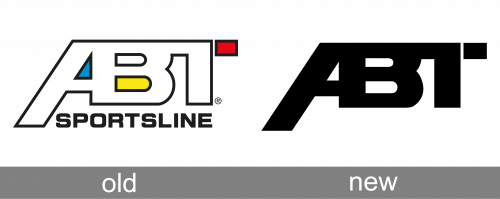
The old logo of ABT boasted a modern outline abbreviation with the three heavy letters set in white, and framed in black, merged with each other. The left bar of the “A” was slightly elongated, and the right part of the “T”s horizontal bar — was separated from the body of the letter. The inscription had three color accents — blue in the negative space of the “A”, yellow in the bottom negative space of the “B”, and red for the cut-off part of the “T”. The badge has accompanied by a bold capitalized “Sportsline” tagline in a modern sans-serif font.
New Logo
After the redesign, the ABT logo kept its contours, leaving the heavily stylized monogram as the only element of the badge. It is now set in flat solid black, with no outlines or color elements. The tagline was also removed, so the current ABT badge is super minimalistic yet powerful and progressive.
Emblem
The logo is simply the three letters forming the company name “ABT.” And yet, the shape of the glyphs and the way they are positioned bear symbolic meaning.
The “A” and the “B” share a bar in common (it is the right diagonal bar of the “A” and the horizontal bar of the “B”). Also, the horizontal bar of the “T” merges with the “B.” As a result, the emblem looks like a road on which auto races are held creating a visual reference to motor racing and auto-tuning.
On the company’s official website, the ABT logo is given in black over the white background. You can also come across a 3D version featuring various shades of metallic gray.
Font and color
The bold stylized lettering from the primary ABT logo is set in massive and brutal capitals of a custom sans-serif typeface, with the three letters merged, and the horizontal bar of the “T” cut. The company uses a designer font for its badge, but there is some resemblance to Brenham JT and Red Five types.
As for the color palette of the ABT visual identity, it is based on plain black, a color of power, confidence, and stability. The monochrome badge of the German company looks progressive and brutal, with clean massive lines creating a strong contrast with a white background.


