A-Style is a brand of casual clothing and accessories, which was founded in Italy in 2001. The company is engaged in the production and sale of T-shirts, polo shirts, and motorcycle helmets. It gained popularity thanks to the successful idea of the brand’s logo, presented at Milan Fashion Week in 2003.
Meaning and history
Even though this fashion brand was established at the end of the 1990s, the A-Style became popular only several years after; when the company’s founder, Marco Bruns, introduced a provocative logo during the Milan Fashion Week in 2003.
In 1999, the logo was printed by Marco Bruns on yellow stickers that were pasted by him on traffic light poles in the city of Milan. This action would prove to be an effective very low-cost marketing operation. In the early 2000s, the logo turned into a trademark and started being printed on branded T-shirts and sweatshirts.
A-Style was a rare case in which the brand was born and became popular long before the product it identified. Thanks to the original and innovative marketing campaigns designed by Marco Bruns, the brand quickly became popular not only in Italy but all over the globe. However, A-Style could not handle the growing competition and ceased all operations in 2015.
What is A-Style?
A-Style is the name of an Italian fashion brand, which was established at the end of the 1990s. Specialized in the design and production of casual and streetwear items, the brand is mostly known for its fun and provocative logotype, introduced in 2003.
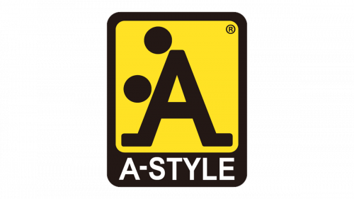
In terms of visual identity, A-Style is very recognizable and provocative. The logo, consisting of an uppercase “A” flanked by two dots, can also represent the stylized image of two people in the sexual act. Although, it is perfectly balanced in terms of colors and geometry.
1999 – Today
The famous A-Style badge, designed by the brand’s founder Marco Bruns, features a vertically oriented rectangle, resembling a road sign and is executed in the yellow and black color palette, the yellow background of the banner boasts a stylized uppercase letter “Al written over it in black, with the diagonal sidebars elongated and bent to the sides at the bottom. The main feature of this element is in two solid black dots, placed on top and the left of the horizontal bar, making the logo look like two people performing a sexual act. The banner had a thickened bottom line with a white wordmark, written across it.
Font and color
The modest and minimalistic white lettering from the A-Style primary badge is set in a very simple and clean sans-serif typeface, which balances the bold and sassy main element of the logo. The closest fonts to the one, used in this insignia, are, probably, Arial Arabic Bold, or Akhbar Bold.
As for the color palette of the A-Style visual identity, it is based on a combination of yellow and black, with an addition of white. Yellow is a color of energy and motion, black is a representation of power and confidence, and white is here for professionalism and trustworthiness.


