The company started working in 1906 in Osaka under the name of Mizuno Brothers Ltd. Initially, the shop specialized in Western sundries. In 1907, order-made athletic wear was added to the range.
Meaning and history
Mizuno is a popular Japanese brand, known as an expert in the production of high-tech equipment and apparel for sports. The company was founded by the Mizuno brothers in 1906 in Osaka. as Mizuno Brothers Ltd. It was a small store that sold mainly baseballs and started offering sportswear in 1907.
So when the Olympic Games came to Japan in 1912, Mizuno was ready to offer the best sneakers for the National teams. Since then, the company has devoted itself to scientific research.
Today the Mizuno logo, known as the Runbird, and first introduced at the beginning of the 1990s, is known all over the globe and synonymous with the innovative approach and comfort in sports footwear.
The Mizuno RunBird emblem stands for limitless expanse and dynamism of sport, it reflects a sense of speed, motion, and strength, and shows the fundamental approach of the company to all the production processes.
What is Mizuno?
Mizuno is the name of a Japanese sportswear brand, which was established at the beginning of the 20th century in Osaka. The business started as a small store selling baseballs and other equipment and grew into a full-fledged brand of clothing and footwear for various sports disciplines.
1906
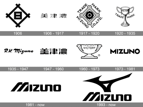
The first Mizuno logo featured two square shapes inspired by the Japanese script. The ends of the bars forming the first, larger, square were crisscrossed. Inside, there was a smaller square divided into two parts by a horizontal bar.
From 1906 to 1981, the company went through a series of logotypes. Some of them were used consecutively, while others could be used simultaneously or return in the same or updated form.
The second logo contained three hieroglyphs and did not look like a logo, in the modern understanding of the word.
The following design had a more international appeal as it featured the writing “Mizuno Co., LTD. Trade Mark” in English. It was written around a square logo inspired by the original one. The outer square looked very much like in the original logo. Inside, there was a bull’s eye design.Later, the brand adopted a completely different emblem. Here, there was a cup featuring the lettering “Victory.” There were also the words “Trade” (on the left) and “Mark” (on the right). The “Victory” cup logo existed in another form, too. In the second version, the cup was shorter and wider. Due to this, the word “Victory” was by far better legible. The words “Trade Mark” were not used here.
The following logo sported an elegant calligraphy-inspired script. The wordmark read “R. K. Mizuno.” Also, the company used an updated version of the logo featuring three hieroglyphs.
One of the latest and best-known logos of this era featured the word “Mizuno” in a bold all-caps font. The “M” had very prominent acute angles. In fact, acute angles were the basic elements of the design.
1906 – 1917
The very first redesign of the Mizuno logo brought a completely different concept to the badge, and now it was just a bold black inscription in Japanese, executed in clean distinctive lines, against a white background with no additional details.
1917 – 1920
Another redesign was held by the company a few years after, bringing back the initial rhomboid frame as the main element of design. Now the center of the rhombus was decorated by a bold circular target sign, and the perimeter of the logo was surrounded by the uppercase sans-serif lettering with the full name of the company.
1920 – 1935
A few years later a completely different logo was introduced by the Japanese sportswear brand. It was an elegant old-school badge with the tall trophy, accompanied by an arched “Trademark” lettering in the uppercase, and the “Victory” engraved on the cup.
1935 – 1947
Another version of the logo, used by Mizuno throughout the years, featured sleek bold cursive lettering in English, with fancy heavy silhouettes of the glyphs, sharp angles, and flared lines with straight cuts, which look unique and very stylish.
1947 – 1960
Another trophy logo was created for Mizuno in the 1940s. The new cup was wide and short, with fewer details around the perimeter, and the “Trademark” inscription removed. The engraved “Victory” got enlarged and looked more modern and confident than on the first trophy badge.
1960 – 1973
The Japanese lettering was brought back to the Mizuno badge, but in a bolder and more confident execution, than the version from the first years of the brand. The thick black lines of the Japanese hieroglyphs looked stylish and balanced, evoking a sense of excellence and professionalism.
1973 – 1981
Until 1981 the Japanese sportswear brand has been using a cool and sharp sans-serif logotype with extended uppercase letters as the main element of the badge. The plain black inscription looked powerful and dynamic, evoking a sense of style, speed, and strength.
1981 – Today
Similar to its predecessor, the new logo featured the company name in a bold type. The number of acute angles was dramatically reduced, though. They were replaced by soft curves. The “M” was now based on three parallel lines.
While this was a pretty successful emblem, the problem was the “M” brought to mind the parallel lines of the Adidas emblem. This was why the company decided to introduce a different logo.
1993 – Today
In 1980, Noboru Kono, who worked as an R&D division leader back then, started to work on this task. His team introduced over 180 versions.
The result of their work, the current Mizuno logo, is known as the RunBird.
Font and color
The custom futuristic lettering from the official Mizuno badge is set in a unique designer typeface with smooth heavy glyphs connected to each other. The closest fonts to the one, used in the Mizuno insignia are, probably, House Sans Extended Heavy and Accelerator Bold, but with most contours modified.
As for the color palette of the Mizuno visual identity, it can be set in bright blue and white, or black and white, both options evoke a sense of expertise and precision and show the brand as a professional, technological and quality-driven one.


