Saks Fifth Avenue is the name of one of the world’s most well-known shopping centers, which is located in New York. Originally named after its founder, Andrew Saks, the first luxury department store was opened in 1867 in Washington and moved to New York only in the middle of the 1920s.
Meaning and history
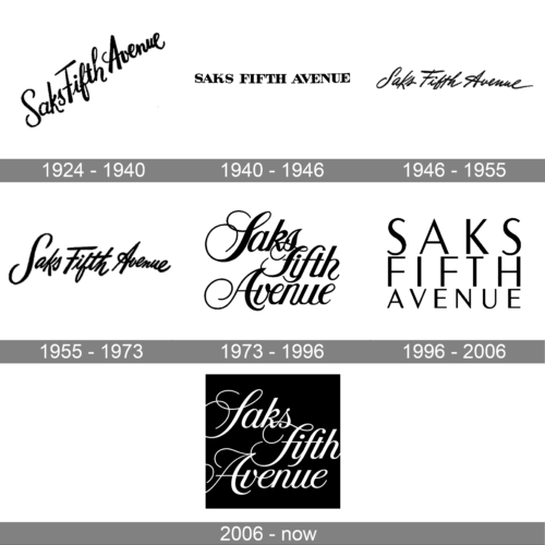
Though the visual identity design of Saks Fifth Avenue was changed several times throughout the years, the monochrome color palette and bold lines of the logotype (which has always been the only element of the identity), of each version represent one and the same — style, confidence, and professionalism.
1924 – 1940
The very first logo for Saks Fifth Avenue was introduced in 1924 and stayed with the company for longer than a decade. It was black handwritten lettering, set in a fancy cursive, and placed diagonally on a white background, going from the bottom left corner to the upper right one. The logo looked quite adequate for its times and evoked a sense of beauty and finesse.
1940 – 1946
The logo, introduced in 1940 featured an ExtraBold serif inscription where all the letters were set in the uppercase and looked strict and stable. Though the smooth thick lines added some elegance and chic, as well as elongated and thin serifs of the inscription.
1946 – 1955
The redesign of 1946 brought a new style to the Saks image. The wordmark was rewritten in a thin fancy cursive with narrowed and italicized letters, and only three capitals — “S”, “F”, and “A”.
1955 – 1973
The lettering from the previous logo was refined and emboldened in 1955. The smooth black lines became thicker and slightly shorter, which gave the insignia a more stable and elegant look. The new badge looked less playful but more chic than the one from 1946.
1973 – 1996
In 1973 the logo was redesigned again, and this time the company decided to go more traditional and classic. The inscription was rewritten in an elegant font with elongated and curved tales of the letters, which were executed in bold smooth contours. It was the last version of the Saks Fifth Avenue logo, where the wordmark was set in one line.
1996 – 2006
The Saks Fifth Avenue logo introduced in 1997 was still based only on the wordmark and executed in a monochrome color palette, but looked completely different from all the previous versions, evoking a sense of fresh air and modernity. The new logo was set in three lines, with the upper one in the largest size, the bottom line — with the smallest letters. The typeface was changed to a clean geometric sans-serif with straight lines and distinct angles.
2006 – Today
The redesign of the Saks Fifth Avenue logo, held in 2006, has kept the iconic black-and-white color palette but switched the shades of the composition, so now the lettering is written in white and set on a solid black square. As for the main style of the badge, it is the same three-level inscription, as on the logo, designed in 1973, with elongated and curved lines and a nice overlapping of some of them.
Font and color
The sophisticated lettering from the primary Saks Fifth Avenue logo is set in a custom cursive typeface, which looks pretty close to such commercial fonts as Controwell or Afferiants in terms of the thickness of the lines and shapes of some characters, however, the capital letters are significantly different due to their thin elongated tails.
As for the color palette of the Saks Fifth Avenue visual identity, it has never changed since the establishment of the brand and has always featured a combination of black and white, which stands for elegance, excellence, and confidence.


