

Logo design is a concept which inevitably goes hand in hand with lots of myths and speculations. We will try to dispel them and set the record straight.
Myth #1: Logo reflects the work of a company
![]()
Many entrepreneurs believe that a logo is a direct reflection of what a person does and what their field of activities is all about. If the logo does not represent a mug, then how on earth will the customers understand that they are standing in front of a coffee shop?
Talking about other examples, it is enough to simply look around. Car manufacturer logo does not always represent a car, and the manufacturer of jackets may not also have something relevant as a symbol. However, Mitsubishi does not cease to do vehicles, Starbucks – coffee, and Apple – one of the most well-known smartphones in the world.
People simply find your logo by entering things like “eating”, “buying a car”, “making a haircut” in the search bar. A logo is the best way to gain recognition – but not to answer the question about the field of your occupation. However, it is not necessary to resort to such a method for these purposes. A store window in addition to banners can contain photos of food and a “coffee shop” inscription with a logo.
The logo which simply reflects the scope of activity is completely un-ambitious. The colleagues will consider you as just another typical company. If you don’t care, that’s up to you. But if your business has developed so much that it is associated with a specific trademark, then you should be original and act as an experimenter.
Myth #2: The more effort you put – the better your logo will be
![]()
For example, you have been asked to order a logo for a sportswear company. You pay a couple hundred dollars to a freelancer and after a couple of weeks you get the first design.
You will be confused by the excessive simplicity of the design outlines. You will require to redo the work again and again. It is always tempting to think that you pay more for the job than it really costs.
Since this situation repeats over and over again, customers become more and more irritated. The discrepancy between the hastily drawn logo and the impressive payment seems too huge. Most of the times, after endless corrections and reworking the customer accept the first of the presented option. People may not understand the features of the author’s design. For them, the most significant value is the degree of effort put in the job.
However, a good job is not measured solely by the amount of time spent on it. If the logo becomes more complicated, this does not mean it became more effective. The most striking example is Nike’s “Swoosh” sign. The absence of the designer’s mistakes is more important than the most virtuosic graphics, besides it doesn’t seem too flashy. This is the hallmark of a good design.
The logo which does not provide a corporate style is completely useless. If you know the scope of application of the logo and if the ideal image of the company and its audience have been thought out, then you should contact professional designers and order the corporate style. If any misunderstandings occur, you should address professional designers. If you have the style, the logo becomes not only a tick in a box, but it also contains a whole concept and brings tangible benefits.
Myth #3: Hidden meaning
![]()
Solving puzzles is nice and useful thing to do. This makes the brain work hard and it makes us glad that we could solve the task. Logos containing full of mysteries and hidden meanings is a frequent phenomenon. The real high-class for any logo designer is the ability to make a reference to the company’s legend and corporate values. But much more logos have no hidden meaning at all, because they do not bring practical benefit.
A person has 1 second to remember the logo without detailing. During a recent experiment volunteers were asked to draw logos of well-known brands such as Lacoste, Apple, Yota, Peugeot, Qiwi, Megafon, etc from memory. The results of the experiment showed that people remember only generalized features of the most famous logos, but have difficulties with remembering their shapes and colors.
Despite this, if a person sees the logo again on the signboard, it will become familiar to him, and it will be more associated with the company. This is exactly what the design means. The hidden meaning of the logo does not affect this process.
People knew about many famous FedEx arrows, Amazon smiles and well-known handshakes on the Hyundai logo only after these companies gained serious fame. Was there any help from the idea enclosed in the logo? We still can’t tell.
The hidden meaning can be a nice addition to the logo, but it is not worth making an assessment based on the meaningfulness of the image. If you chase after the expression of a profound idea, you risk losing all the use of having a simple sign.
The hidden meaning will not be a hindrance with organic application. The rule is steep – however it is not obligatory at all.
Myth #4: Say no to bad logos
You will mislead your customers if you simply copy your logo from a competitor which is not a good sign at all.
Trying to achieve originality simply to stress out this very originality is not a good strategy either. If the degree of originality of the logo exceeds all limits, it will seem unrealistic. The client will choose to have business with your calmer competitors. As for the field of activity, there are certain standards of what should be used and what shouldn’t be used. Just take a look at the logos of coffee houses or automotive manufacturers. Having common elements in logos is an unalterable rule here.
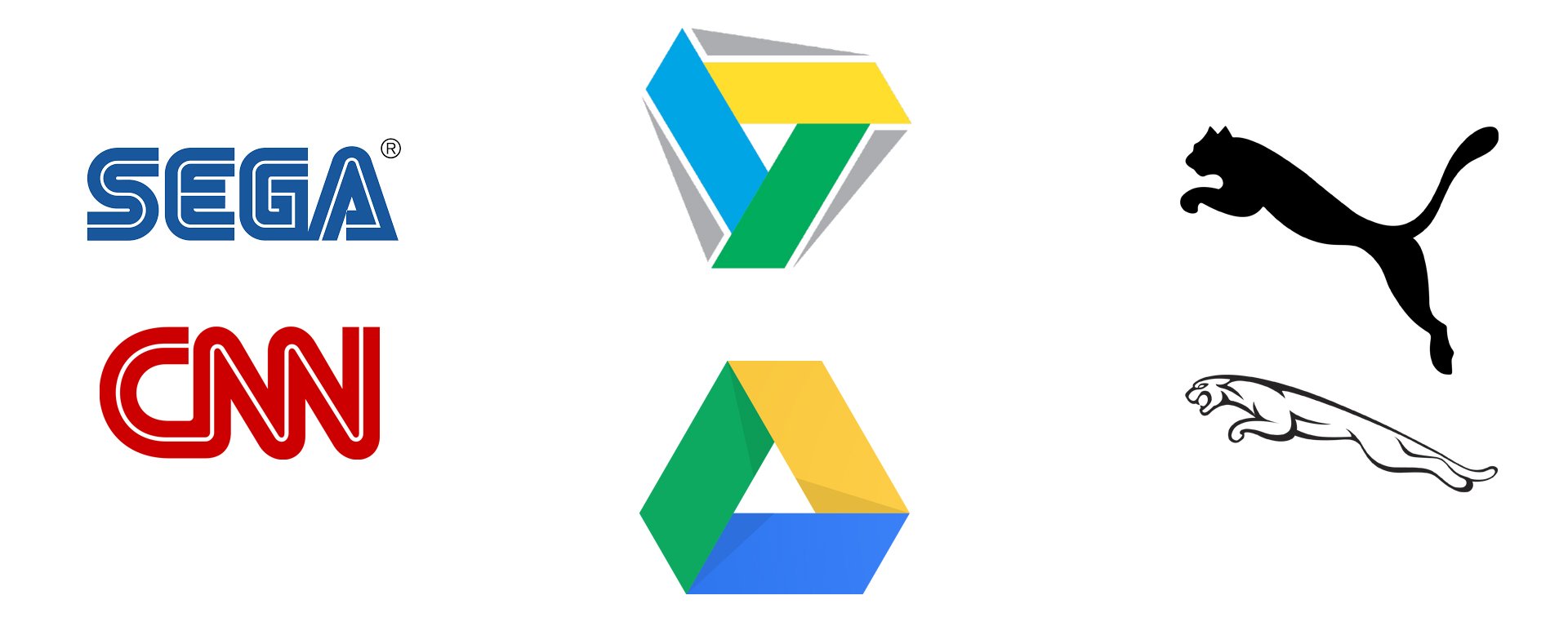
The process of finding plagiarism is exciting, but it does not affect the performance of the most famous logos from Puma and Jaguar, CNN and SEGA, Promt and Google Drive, Land Rover and Ford, Gucci and Chanel. These companies are recognizable and they will not be affected. The desire of a designer to create distinctive logo looking unlike any others is a common stereotype. The letter “A” will always remain the letter “A”. This concerns certain graphics solutions where the difference in most logos will have to do only with details.
Similar logos might be a reason for a frustration – meanwhile, this is quite an ordinary phenomenon. Every day thousands of new logos are created using proven graphical techniques.
However, it is not the best decision to simply copy other people’s ideas. You should accept the fact that you will not be able to create something fundamentally new. Among millions of logos there must be the one that resembles the original. Otherwise, something is wrong with it.
Myth #5: What can be more important than logo?
![]()
Despite the significance of logos, their importance is often overestimated. They cannot provide a 100% guarantee that they will attract customers. The coolness of the agency that created certain logo and the number of colleagues who showed the praise does not matter at all. The importance of the company’s logo is the same as a beautiful face that will allow you to achieve success in your career. It is quite natural that a logo cannot be appreciated be everyone, but it also shouldn’t be discussed all the time or constantly re-designed.
For example, not everybody was satisfied with the last rebranding from the world famous Pepsi Company. The logo shows flatness and portliness, having lost its inherent color. In online publications various media sources were quick to accuse the company of pointlessly wastes funds, selling old ideals and other sins that had virtually nothing to do with reality. This resulted in the fact that the Pepsi was banned in 47 countries around the world, followed by the company bankruptcy and the execution of the chief designer. Ok, that was a joke.
First of all, it is the style, not the logo itself, which is important. If the creation of logo is done by a professional designer, then he necessarily considers the location of logo, the selection of branded fonts and colors, and the creation of presentations. This is required in order to show the design of employee uniforms, packages, website signage and other nuances specified by the customer.
Even the most successful picture will not work. The success of the logo is possible only with its proper use. The information based on the corporate style of the company can be placed on the signboards of products, on the uniforms of the employees and in other places. If the logo is designed successfully, it acts as it should and becomes a “household name”. Millions of people wear T-shirts produced in China which they bought in online stores only because of the green Lacoste crocodile logo or widely recognizable “Swoosh” from Nike.
Conclusion
Any myth concerning design has its own explanation. Strict rules might be only kept in mind, but they hardly exist in reality. Well, we figured out about the most common stereotypes responsible for the role of the logo, image, considered plagiarism and the importance of corporate style. No need to tilt windmills – you only to know the direction of the wind.


