3M is a corporation, which was established in 1902 in the United States and specializes in different segments, such as consumer goods and health care. The company owns 10 brands and manufactures more than 60 thousand various products, including stationery, dental care, and electronic items.
Meaning and history
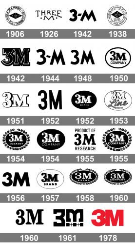 The name of the company was formed from Minnesota Mining and Manufacturing Corporation, which abbreviation is MMM, or simply 3M. The company has a rich history, and its visual identity timeline shows all its most important milestones.
What is 3M?
3M is an American company, which was established in 1902 as a mining venture. Today 3M is engaged in different spheres, including health care and worker safety, but is mostly known worldwide as a manufacturer of consumer goods. The products of the brand are available worldwide.
1906 — 1938
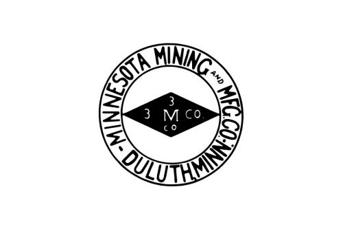
The first logo was designed at the beginning of the twentieth century. It was a solid black rhombus with a white “3 M Co” inscription on it. The Diamond was enclosed in a double circle frame, where the long company’s name was written in all capitals.
1926 — 1938
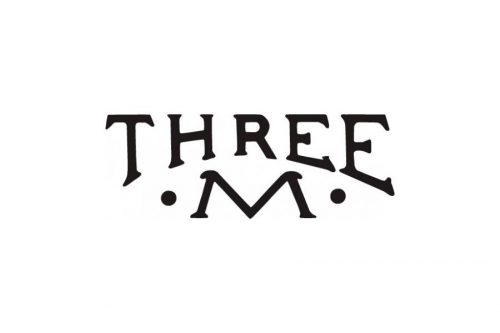
Two additional versions of the logo were created in 1926. One of them was a simple inscription “Three M” with two solid dots from both sides of the letter.
Another one depicted a framed rhombus with a black “3 M Co” lettering inside, just like on the original version, but a lighter and a more modern one, due to the switch of the colors.
1937 — 1942
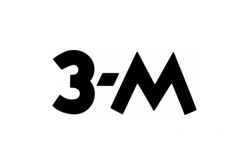
The version introduced in 1937 started a whole new era in the history of the 3M logo. Now, there were only two bold black characters and a hyphen in between. The design was minimalist and easy to grasp. It stood out among the cluttered, decorated logos of its time. It would have looked modern even now, while for its own era, it was probably futuristic.
1938 — 1942
The original logo was still in use in 1938, but the typeface was refined and changed to an elegant serif one. However, the secondary logo, which resembles the one we all know today, was also designed to accent on the company’s progress and growth.
It was a bold solid “3 M” logotype with a short dash, cut diagonally. It was a clean and minimalist emblem, evoking a sense of confidence and power.
1942 — 1944
The experiment of 1942 brought a serif font to the logo. The bold black digit with the letter had a thin white outline, looking bright and masculine.
1944 — 1948
However in 1944, the company decides to come back to the version from 1938, but the dash is now thinner and placed diagonally. It was a recognizable logotype, showing the unique character and fundamental approach of the group.
1948 — 1950
The dash was completely removed from the visual identity in 1948. The contours of the inscription were refined and it gained a better balance in size and spaces.
1950 — 1951
The logo from the 1950s was composed of a “3M Company” inscription enclosed in an oval frame. The upper part of the wordmark was executed in an extra-bold serif typeface, while the “Company” part in all capitals was written in a sans-serif font.
1951 — 1954
There were two different versions of the logo used during this time period. One of them was based on the serif lettering, another one was more modern and laconic, depicting a narrowed and elongated sans-serif inscription.
Sometimes the logo was used on its own, sometimes it was enclosed in a black oval with a white background. But the most common version was white lettering placed on a black oval.
1952
Another experiment based on the laconic “3M” wordmark without a single additional element. This time, the side bars of the “M” are vertical, not diagonal.
1952 — 1954
This version is by far more cluttered due to the serifs, the black oval, and the word “Brand.” All these dilute the simple beauty of the previous version.
1953 — 1954
Looks like someone had asked the designers to “make this logo more elegant and decorative.” This resulted in a messy design. Even though the name of the brand is short and, in itself, supposes a minimalist look, the authors of the logo managed to find multiple ways of cluttering it.
In addition to the serifs and rounded dots on the ends of the “3,” they used shades, the word “Line” in a decorative script (and with a rope design, as if to make the matters worse). Even the word “Brand,” which used solid lines in the previous version, now was white with a black outline.
1954 — 1955
 In 1954, the company continued using its previous logo, but now it gained a laurel wreath around it, which was removed from time to time. The lettering was written with a thin white shadow now, which added elegance and volume to the whole image.
1954 — 1957
There is less noise here. This is partly due to the disappearance of the words “Line” and “Brand” – they were replaced by the lettering “Company” written in a by far simpler type.
1955 — 1958
Once again, it seems as if someone had said “Why is our logo so simple? Let’s add something beautiful and elegant.” This resulted in a generic laurel wreath like in a million other logos.
1956 — 1957
For a year, the company returned to the simple beauty of the two-character wordmark. The type was slightly heavier than in the previous ones, it looked more proportional.
1957 — 1958
The oval version with the serifs and the word “Brand” didn’t lose the love of the company’s top executives, though, and they went on experimenting with this theme.
1958 — 1960
At one point, the 3M logo even returned to the infamous laurel wreath.
1960
The laurel wreath logo was used either with the word “brand” or with the word “company.”
1960 — 1961
At the beginning of the 1960s, the company decides to get back to minimalism and creates a new logo, which is composed of a bold smooth “3M” lettering in a clean and sophisticated serif font.
1961 — 1978
However, the previous logo only stays with them for a year, as in 1961 the new version was designed by Gerald Stahl Associates agency. It was a remarkable custom “3M” logotype, with a flat top and bottom lines of “3” and sidebars of “M”. The two symbols were completely similar, just placed in different directions. It was an outstanding contemporary visual identity for a powerful and influential company.
1978 — Today
The logo we all know today was designed by Siegel&Gale bureau in 1978. It is composed of an extra-bold lettering, executed in a traditional Helvetica typeface, with “3” and “M” “glued” to each other.
This is also the very first colorful version of the visual identity for this company — it uses scarlet red as the main, which turns to black on the printed versions.
Red and the white color combination is a reflection of power, passion, and energy. This combination perfectly represents the corporation and its principles.
Shape and Colors
The shape of the 3M logo is very simplified: 3 and letter M are situated very close to each other and have a much more impressive font which adds to the logo more power, status and intensity. The director of the Siegel+Gale has insisted on adding new color to the logo – red, as it enhances the idea of endurance and stability of the company.


