Skype is one of the companies that managed to get to the top in a relatively short period of time. Its logo has not changed much except for a slight alteration of the color scheme.
Meaning and history
Being one of the oldest and most popular messengers and network service providers, Skype has had many visual identity redesigns throughout its history, though all of them feature a unique and recognizable style, so the transmutation from one emblem to another has always been smooth and delicate.
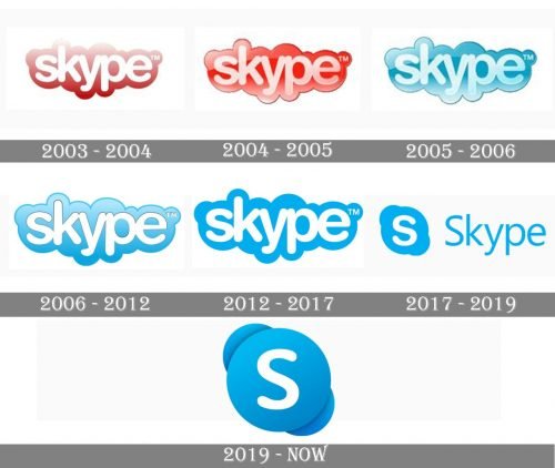
2003 — 2004
The original Skype logo, introduced in 2003, was composed of a rounded white wordmark in the lowercase, laced on a gradient red background, repeating the contours of the inscription. The red and white color palette stood for professionalism, passion, and energy of the company, and its progressive approach to adopting the latest technologies.
2004 — 2005
In 2004 the logo was redrawn and made three-dimensional, by adding darker shades of red to a thick outline, and some light gradients to the inscription itself. The outline now looked more like a cloud, evoking a kind and welcoming feeling.
2005 — 2006
The redesign of 2005 switched the red Skype color palette to blue, and this color stays with the brand today. Bothe the cloud outline and the inscription were executed in gradient shades.
2006 — 2012
In 2006 the lettering is being simplified and starts being drawn in plain white, while the blue cloud becomes brighter and has its upper part in gradients, looking shiny and vivid.
2012 — 2018
The redesign of 2012 makes the Skype logo simple and flat, adding a sense of seriousness and professionalism. The contours and the composition remain untouched, though the simplified color palette makes the letters look bolder and smoother.
2017 — 2019
In 2017 the concept of the Skype visual identity was changed for the first time. The iconic cloudy wordmark was replaced by a bright icon, placed on the right from the lightweight title-case wordmark in a traditional sans-serif typeface. The emblem featured a rounded bright blue shape with a bold white letter “S” on it. The “S” was executed in a thick r oh never typeface, resembling previous logo versions.
2019 — Today
In 2019 the wordmark was removed from the Skype logo and the emblem we all can see today is a stylish and minimalist badge, consisting of a gradient blue circle with white “S” on it, placed over a thick diagonal line with its ends softened and rounded. The emblem looks brilliantly as the brand’s signifier and icon, representing the software at its best and showing a strong link to its roots, along with the ability to love and change.
Symbol
The earliest Skype logo looked almost the same as the current one except for the 3D effect applied to the cloud shape, on which the word “Skype” appears. In 2012, shortly after the acquisition by Microsoft, the background the 3D effect disappeared, color scheme became simpler, it was reduced to white and one shade of blue.
The “S” emblem
In addition to the wordmark logo Skype has a simple emblem that is used as its icon. In fact, the earliest Skype icon looked very different from what it is now. First, it was a small yellow “cloud” (2003), then a white rectangular inside a blue rectangular (2003), than a more complex image built out of several circles (2004). However, all these logos did not last long, and as soon late 2004 the now-familiar “S” emblem was introduced. It had almost the same shape as the one used today, but proportions were slightly different. Also, the color scheme was altered and new visual effects applied. Today, the icon comprises the white “S” character against the light blue background with a 3D effect.
Icon
Skype Icon in blue and white was redesigned several times, with each of the official logo changes. Though it still looks similar to all the previous versions due to the smoothness of the lines, rounded shapes, and the iconic blue and white palette. The Skype Icon, introduced in 2019 is based on Fluent Design principles. This is the style of graphical user interface previously known under the codename Project Neon. Two light blue layers with a soft white “S” as the main figure.
Font
The Skype wordmark is based on the font Arial Rounded MT Bold typeface. This font was designed by Robin Nicholas in 1993.
Color
The color palette includes white and a clean, light shade of blue. There are two possible versions:
- the brand’s name given in white is surrounded by a blue cloud
- the inverted color scheme: the word “Skype” (blue) is given against a white cloud placed into a rectangular shape (blue).


