

![]() QVC Logo PNG
QVC Logo PNG
The logotype of the television network QVC has gone a way from a simple wordmark to a minimalistic, yet meaningful emblem reflecting the company’s specialization.
Meaning and history
![]()
The idea of the “store on the couch,” Developed by Franklin Mint founder Joe Siegel, came to fruition in 1986 in the form of the television home shopping chain, QVC. The company adopted the concept of “theatrical retailing” and turned it into a successful business that today operates around the world, bringing in millions of dollars.
The name of the tv channel is derived from “Quality Value Convenience”, the three whales, standing at the core of the business idea, QVC offers its customers products of high quality, for a good value, and they can be purchased with all the possible convenience: directly from the coach, over the phone, while watching TV.
What is QVC?
QVC is an abbreviation, standing for Quality Value Convenience, an American tv channel, founded in 1986, and specializing in televised shopping. Today the channel operates internationally, offering its subscribers various goods, which they can buy sitting on their sofas.
1986 – 1993
![]()
The QVC is a leading shopping channel dealing with televised home shopping. The company established in 1986 broadcasts to over 345 million households in 7 countries. From 1986 to 1993, the company used two emblems. The primary QVC logo used at the time featured the name of the channel in black. The letters belonged to a custom serif typeface.
In the alternative logotype, there was a receiver over the wordmark, which made it look like a phone. Both the elements of the design were placed into a box.
1993 – 2007
![]()
In 1994, the QVC had its logotype updated. The black color was replaced by pink, which added a softer touch. The letters looked thinner. The design of the “Q” was modified most.
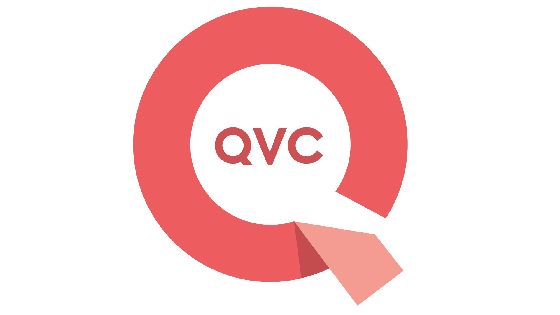
2007 – 2019
![]()
The 2007 rebranding brought about a new, near-cyclic “Q” housing the name of the network. What makes the emblem outstanding and appealing is that it looks like a ribbon with a loose edge “inviting” to unravel it. It actually looks like someone has already started to open the “package”, which makes you want to reach and touch it with your own fingers. The ribbon theme seems highly relevant to the company’s business. The negative space inside the QVC logo resembles a speech bubble.
2019 – Today
![]()
The QVC logo was redesigned again in 2019, with the composition of the badge dramatically changed. The new concept of the QVC visual identity is based on a combination of an emblem and a lettering, executed in a dark blue and orange color palette, with all elements drawn in medium-weight lines against a plain white background. The QVC emblem features an elegant uppercase “Q” in blue, set in the middle of a square with an orange outline. As for the inscription part, it is executed in a modern yet elegant sans-serif font, with all capitals written in dark blue.
Font and Color
The elegant medium-wright lettering from the primary QVC logo is set in a fancy modern sans-serif typeface with a slightly elongated and beautifully curved tail of the capital “Q”. The closest fonts to the one, used in this insignia, are, probably, Meroche Medium, or Wonder Harden Sans Serif, but with the bottom part of the “Q” modified.
As for the color palette of the QVC visual identity, it is based on a stylish yet delicate and calm combination of deep blue and muted orange, which together makes up a very sophisticated color scheme, standing for excellence, elegance, and reliability.![]()
The sans serif letters inside the emblem look classic and simple. We can’t say that they add much to the overall logo, yet this is probably the effect the designer was trying to achieve, as the lettering doesn’t steal the limelight from the main symbol.
The 2008 rebranding brought about the two main colors: teal for the television version and pink for the web version. There is every possibility that the soft shades are supposed to appeal to female audience.


