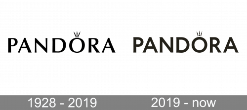
Pandora A/S is among the world’s most famous jewelry manufacturers. The Danish company started its history as a family-run jewelry shop in 1982. Pandora logo is an immediately recognizable wordmark. Its most distinctive feature is an elegant crown over the “O” character. The crown reminds of the fact that Pandora offers a universe of high quality, genuine jewelry supposed to make its owner stand out in the crowd.
Meaning and history
Pandora is a global brand of jewelry. It stands out among its competitors with its original design and high craftsmanship of jewelry, its elements individually.The company was founded in the early 1980s in Copenhagen, where a young jeweler Per Enevoldsen, and his wife Winnie Liljeborg opened a small jewelry store.
The jewelry shop was a success, and the couple decided to expand the business. In 1987 they took designer Laun Frandsen to the team, and he helped to create the first collection of jewelry. Later another famous designer Lizabeth Larsen joins the team.
The idea of bracelets made of gold, leather, and silver with interchangeable pendants so pleased the customers that Pandora switched to wholesale sales. For convenience, speeding up the creation of original jewelry in 1989, the founders move the production to Thailand.
In 1999, the spouses developed their concept of modular jewelry, which is still the trademark of the brand.
What is Pandora?
Pandora is the name of one of the major manufacturers of jewelry, known on all continents of the planet. The Danish brand was established at the beginning of the 1980s, and by today has become synonymous with elegant and fancy jewelry with recognizable decorative elements.
1982 – 2019

The original Pandora wordmark had capital, sans-serif letters in it. They were rather thin, although the width of the lines subtly changed to even slimmer proportions here and there. Above the letter ‘O’, there was a small image of a crown. It’s a simplified symbol, consisting of a miniscule rectangle, three dots and three triangular peaks.
2019 – Today
Many things changed here. Firstly, the font became a less elegant, uniform style with bolder lines. The crown got rid of the rectangular base, but was otherwise unchanged. Lastly, the coloring switched from jet black to dark brown.
Icon
After the latest redesign, Pandora started using a very special and tender color, powder pink. The brand chose a pink hue to stand out from competitors Tiffany & Co. and Swarovski. The new branding is thicker than its predecessor, with smaller gaps between the letters. The new version of the Pandora Icon also has changed and now it does not have any line under the crown symbol.
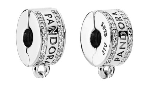
How to determine the originality of Pandora jewelry?
The letter “O” became the new monogram of the brand. It was the crowned letter on a pink background that became the company’s avatar in social networks. The updated visual identity is designed to convey a fresh and modern tone, and the pink color became a new recognizable element in the points of sale.
Font and color
The name of the company is given in a perfectly legible sans serif typeface. All the letters are capitalized. Interestingly enough, although there does exist a font named Pandora, it is not the font actually used in the logo of the namesake company. The type bearing the name “Pandora” looks rather weird, if not eerie. Hardly a surprise, taking into consideration that American Horror Story is cited as its inspiration. The Pandora logo font is different. It is a customized typeface very similar (yet not identical) to Optima Demi Bold created by Hermann Zapf.
The wordmark is built around a simple black-and-white color scheme, emphasizing the elegance and refinement of the Pandora jewelry.


