Elena Miro is an Italian fashion brand, which specialized in the manufacturing of clothes and accessories for plus-size women. The history of the Italian fashion house Elena Miro started in 1984 when the fashion house was established under the name DAME. It was established by Giuseppe Miroglio, Elena Miro’s husband, and this label started not only the successful women’s brand but also a successful family business — Miroglio Group Corp.
Meaning and history
The Italian brand Elena Miro has been producing women’s clothing of large sizes since the middle of the 1980s, and never wanted to change its specialization. After all, the philosophy of the brand is the idea of allowing every woman to show her femininity, and to be beautiful. Strong motivation under the leadership of Miroglio Fashion Corporation has led the brand to become a plus-size trendsetter.
Today Elena Miro is a brand within Miroglio Group Corporation, which occupies one of the leading places in Europe in the production of clothes, fabrics, yarn, and threads. Founded in 1947 by Giuseppe Miroglio, Elena’s husband, by today the company has reached enormous results, having more than two thousand stores across the globe.
It was Giuseppe, who decided to change the DAME name of the brand into Elena Miro, and this is how he celebrates his wife. The result of this amazing family tandem keeps making plus-size women from all over the world happy for already more than twenty years.
Elena Miro emphasizes the woman’s beauty that differs from the models’ standards and moves away from stereotypes. The brand offers elegant and fashionable clothing along with comfortable casual solutions for every day.
What is Elena Miro?
Elena Miro is an Italian fashion brand, established by Giuseppe Miroglio and his wife Elena in 1984. The label specialized in the production of plus-size clothing and accessories for women and is considered to be not only the world’s pioneer but also the most successful brand in this segment.
As for the visual identity, the plus-size fashion brand from Italy uses a very delicate and smooth logo, and this effect is gained by the use of the lowercase letters, which look friendly yet professional at the same time.
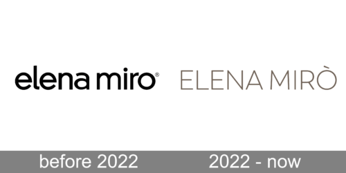
Before – 2022
Simple as it is, the Elena Miro logo has a refined and elegant touch characteristic of the brand itself. All the letters are lowercase. The glyphs look soft and rounded. The small curve on the “l” hints at the beauty of handwritten scripts. The dot in the top right corner replaces the accent sign above the “o” in the name of the line.
The typeface, used in the Elena Miro logotype is very close to such fonts as Kaleko 205 Medium and Kessel 105 medium, although with the elongated and curved tail of the “L”, which makes it unique.
2022 – Today
Although the company kept the logo simple and sophisticated, it updated the wordmark by changing the color and font. Here, the name is printed using all uppercase characters and features a finer, more elegant sans-serif font that looks exactly like Trenda Light with an accent above the “O”. The designers also steered away from a formal black color and chose a light brown with a hint of pistachio color. This gave the logo a unique touch, while its simplicity created a modern and stylish look.


