

![]() Oakley Logo PNG
Oakley Logo PNG
Oakley, Inc. is a California-based manufacturer of sports equipment and lifestyle products including sunglasses, sports visors, watches etc.
Meaning and history
![]()
Oakley is the brand, which is best known for its sunglasses, and its current logo perfectly represents the purpose and style of the company, making its “O” emblem similar to a glasses’ lens.
There have been three major redesigns of the Oakley logo throughout the company’s history, and starting the second version, the emblem became the main part of the brand’s visual identity.
1975 — 1993
![]()
The original Oakley logo, introduced in 1975, boasted a custom extra-bold logotype, executed in a smooth yet solid and masculine sans-serif typeface with almost all the letters connected. The only two letters standing separately are the “K” and the “L”, and the triangle they form in the negative space looks like another element of the visual identity, pointing to the brand’s progressiveness and individuality.
1993 — 1997
![]()
The redesign of 1993 completely changed the Oakley emblem, though still had a link to the previous version in it. The wordmark in a new thick and rounded sans-serif was extended and drawn in black, but its letters featured the same connection lines between each other as on the logotype from 1975.
Above the custom lettering, there was an enlarged and bold letter of, also extended horizontally. It stood for the first letter of the brand’s name and resembles its main focus — sunglasses.
1997 — Today
![]()
In 1997 the brand redesigns its logo again, replacing the connected letters with the inscription in a bold and straight sans-serif typeface, where each of the capital letters of the logotype was massive, confident, and clean. The contours of the emblems were also refined, but it kept its shape and color.
During the same period, there was also a three-dimensional emblem created for the brand, and it featured a gradient voluminous oval in black, with a thick silver outline. This emblem was usually placed near the logotype, featuring the official style, but drawn in gray.
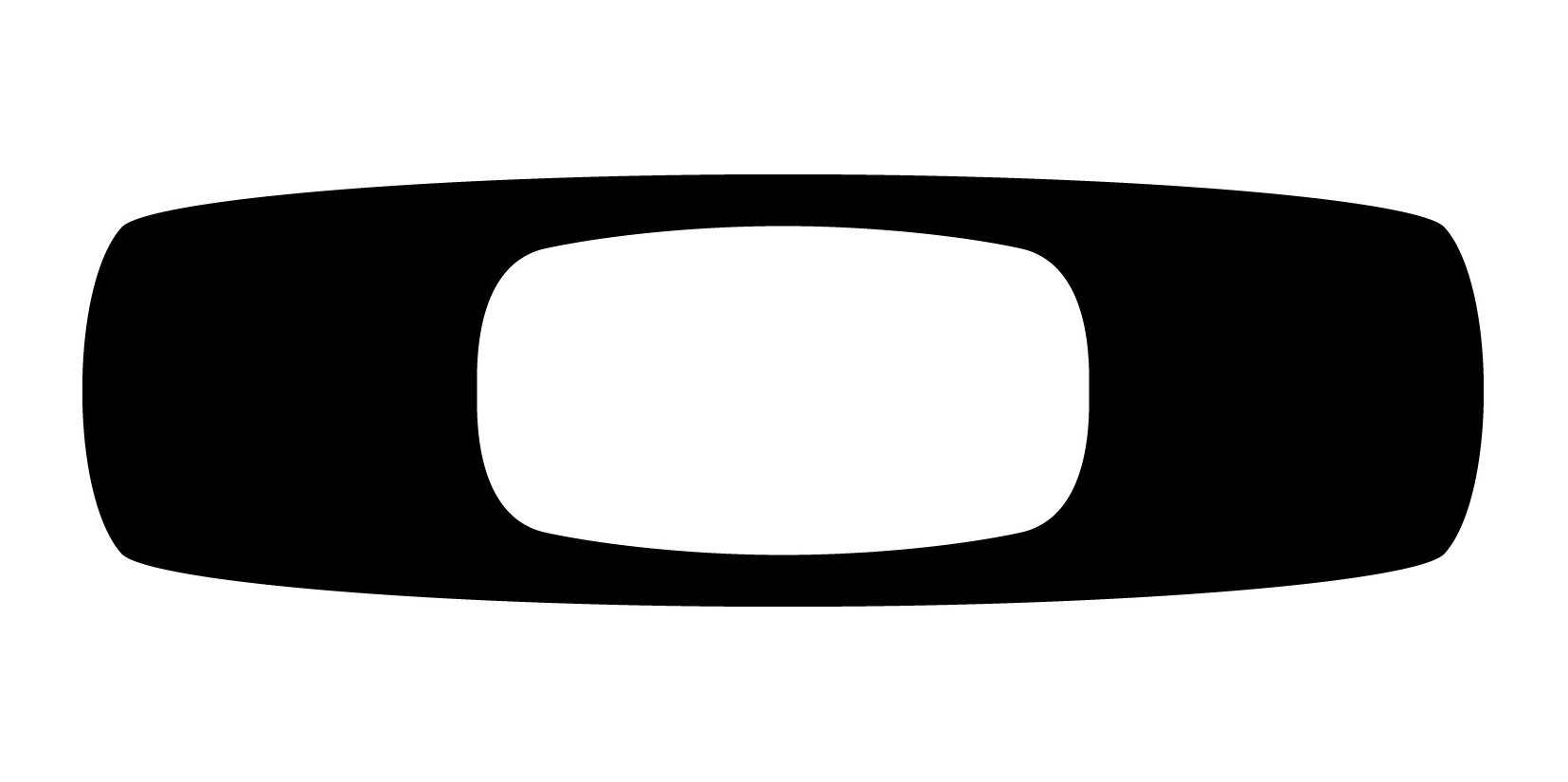
The 2000s — Today
![]()
In the middle of the 2000s, the logo was redrawn again, making the wordmark’s letters pattern diagonally striped, in monochrome. The emblem was also modified, and now it is not a horizontally stretched oval, but a rectangle with softened corners and slightly arched horizontal bars.
Symbol

Absolutely simple and minimalistic, the Oakley logo manages to represent not only the company’s name but one of its main product groups (sunglasses and optical frames), too. Interestingly enough, it even resembles the shape of one of the buildings forming Oakleys headquarters in Foothill Ranch.
Emblem
The emblem represents the company’s initial, the letter “O”. The character is flattened so as to look more like a horizontally positioned oval shape.
Font
![]()
The company opted for a rather traditional bold typeface without any off-beat elements. It is an old-school bold sans-serif font, all the letters are capitalized.
Color
![]()
The classic combination of black and white chosen by Jim Jannard creates an appealing visual contrast. The color choice embodies the elegance and refinement that are supposed to be some of the brand’s main virtues.


