One of the world’s largest entertainment companies, Netflix was created in 1997 in California. Its main focus is streaming media and video-on-demand online and DVD by mail.
Meaning and history
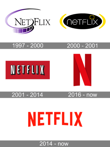
The company was founded by Marc Randolphand and Reed Hastings. In 2008 there were just 30 employees and less than a thousand DVDs available. However, the company was an immediate success and started growing very fast. Starting from 2013, it has also been working in the field of film and television production. Currently it employs over 3,500 people.
What is Netflix?
Netflix is one of the most popular streaming video services in the world. The service is available worldwide and has app versions for both iOS and Android devices. The app itself is free to download, but the content is available on a subscription basis, as is the service website.
1997 – 2000
The earliest Netflix logo featured the name of the website, with the celluloid film separating the “T” and “F” characters.
The inscription was set in a title case of a very elegant typeface with bold and sharp serifs on the ends of the bars. That geometry and sharpness were beautifully balanced by the rounded graphical element, which was placed under the “Net” part of the logotype, being drawn in gradient shades from light purple to black. The color palette of the initial logo stood for creativity and imagination, white the black lettering added to the professionalism and stability.
2000 – 2001
In 2000 Netflix introduced a new version of the logo, which only stayed with the company for a few months. It was a solid black oval badge, stretched horizontally and enclosed between two rounded yellow brackets. The logotype in the lowercase was written in thin white lines of a modern square sans-serif typeface, with the dot above the letter “I” replaced by a yellow square frame with rounded angles, resembling a TV-screen.
2001 – 2014
Only three years after the company was launched, it adopted a new emblem. It featured the word “Netflix” in a sans-serif font on the red background.
The inscription was set in white narrow capitals, which were placed pretty far from each other, and it gave a very interesting look to the badge, which was also elevated by the bold black outline of the letters and straight bold black shadow on the right. The red shade of the Netflix badge background from the beginning of the 2000s was a bit different from the iconic red we all can see today – darker and calmer, adding a bit of mystery to the image.
2016 – Today
In June 2016, Netflix presented a new letter emblem consisting of a solitary “N”. It was not a replacement for the current wordmark but rather a small-sized alternative. The need for it arose with the spread of mobile apps and social networks, where the full Netflix wordmark did not work well. Having replaced the wordmark with one letter, the company got a chance to better compete with all the other things visible on a mobile screen.
It is worth mentioning that the new emblem was not just taken from the logo, but created from scratch. It looks like a red ribbon folded over itself so that it forms the “N” character.
2014 – Today
The current Netflix logo debuted in 2014. Simultaneously, the company launched a new website. To create the new brand identity, a New York-based design firm called Gretel was commissioned. The core visual metaphor for the new logo was a stack. According to Gretel, it conveys two ideas that are crucial for the Netflix service: an infinite catalogue and custom-curated selections.
The updated wordmark looks very much like the previous one, but it utilizes a more contemporary font with the drop shadowing removed. The characters have become bolder. The color scheme has also been tweaked, although red has preserved its role as the most prominent color.
Icon
Over the last years, the Netflix logo and icon have become one of the most recognizable visual identity elements all over the globe. For its Icon, Netflix uses the same style and color palette, as for its official emblem — red and black. The only difference between the icon and the logo itself is that the icon only uses one capital “N”, formed by three red ribbons, with the diagonal one drawn in the most intense shade of red.
The red letter is placed on a plain black square, which can have its corners straight and classic, or rounded when used on mobile applications.
Font
The customized typeface used for the current Netflix logo was created on the basis of two fonts: Gotham Bold and Gotham Book.
The uppercase letters of the logotype are written with thick strict bars, with the top edges cut straight and the angles sharpened. As for the bottom edge of the inscription, as it is slightly arched to the center, some bars of the letters are elongated, and others, on the contrary, are shortened. The main characteristic of the Netflix wordmark font is stability. Each letter can be used on its own, and will still look perfect and full-fledged. The bold geometric sans-serif typeface shows the service as a super solid and professional one.
What font is used for the Netflix logo?
The arched Netflix logotype in all capitals is executed in a clean and straight Sans-serif typeface, which is Graphique, designed in 1945 by Hermann Eidenbenz. The typeface also looks similar to such fonts as Gineso Titling Black and Cream Opera Black.
Color
The streaming media service chose the combination of red and white colors as a standard for its emblem. Red symbolizes passion and energy, while white was probably chosen as a neutral background, against which the basic color stands out.
Although. The red, used for the Netflix badge, is quite dark and deep, which adds to the “energy” meaning a bit more solidity and professionalism. It also represents the warmth the service treats its users with, aiming to provide them with video content to spend any day and any time of their lives watching and enjoying it.
What does the Netflix logo symbolize?
The Netflix logo is simple, clear, and straightforward, and it blends seamlessly into all of the platform’s materials and content. Its bright red uppercase inscription represents passion for movies, and the power of the company, which spreads all over the globe.
Is Netflix a logo or a symbol?
Today Netflix has two types of logos, used for its materials and videos — a stylized uppercase logotype, and an icon, which depicts a graphical letter “N”. Although, the primary version of the badge is the inscription.
Why did Netflix change its logo?
Netflix’s original logo has a hint of Hollywood aesthetics – a reference to the trademark images of Universal, Fox, and Warner Bros. For the startup, launched in 1997, such a decision was connected with intellectual positioning. In addition, the similarity with the old Hollywood logos also had a practical purpose – the legibility of the text on the screen.
Is Netflix changing its logo?
Netflix has been pretty consistent with its visual identity since the current logo version was introduced in 2009. For a young service, this is a pretty surprising loyalty to one image, but this red-arched inscription brilliantly works for all the main purposes of the streaming service.


